|
I think this piece has reached a conclusion. I'm fairly pleased with the way it turned out; it looks like what I wanted it to. I like how the black outlines on everything makes things pop. If I was to create this piece again, I would firstly draw much lighter on the final. I wasn't expecting the marker to be as transparent as it was, and even though I erased my pencil lines, they still showed through more than I though they would. When coloring, the darker colors were pretty opaque, but in the places I used the lighter markers stroke lines are pretty visible, which was to be expected. In the future I could maybe use paint on a canvas if I was doing something in the same stylized way. I do like how dynamic the piece is, and how there is negative space around the drawing as opposed to it filling up the entire page; it makes it less chaotic I think. I could have done a better job planning out what overlaps what because while coloring some of my guidelines weren't super clear, which resulted in some things overlapping in a way they shouldn't have, but overall I don't think it's too noticeable. Overall, I enjoyed creating this piece, but moving forward I think I'm going to explore other ways to add color to my pieces. Even though it did take me time to plan out and sketch, and I really did like incorporating organic shapes and block color into the piece, it feels too simple for me to make another piece in the same way. 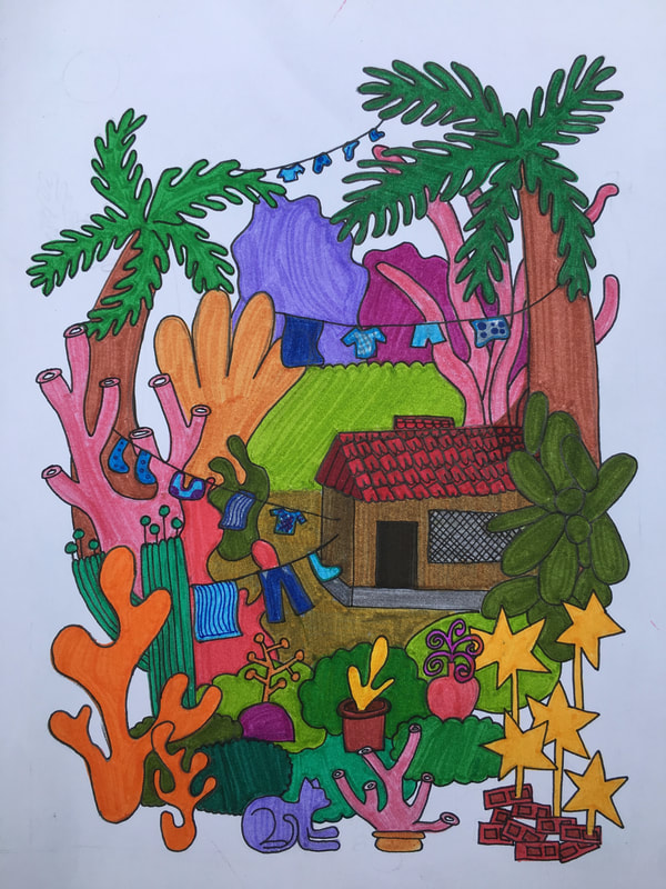
0 Comments
Leave a Reply. |
Ria BakshiCheck out what I'm currently working on by clicking the PROCESS button! Archives
December 2020
Categories |
 RSS Feed
