|
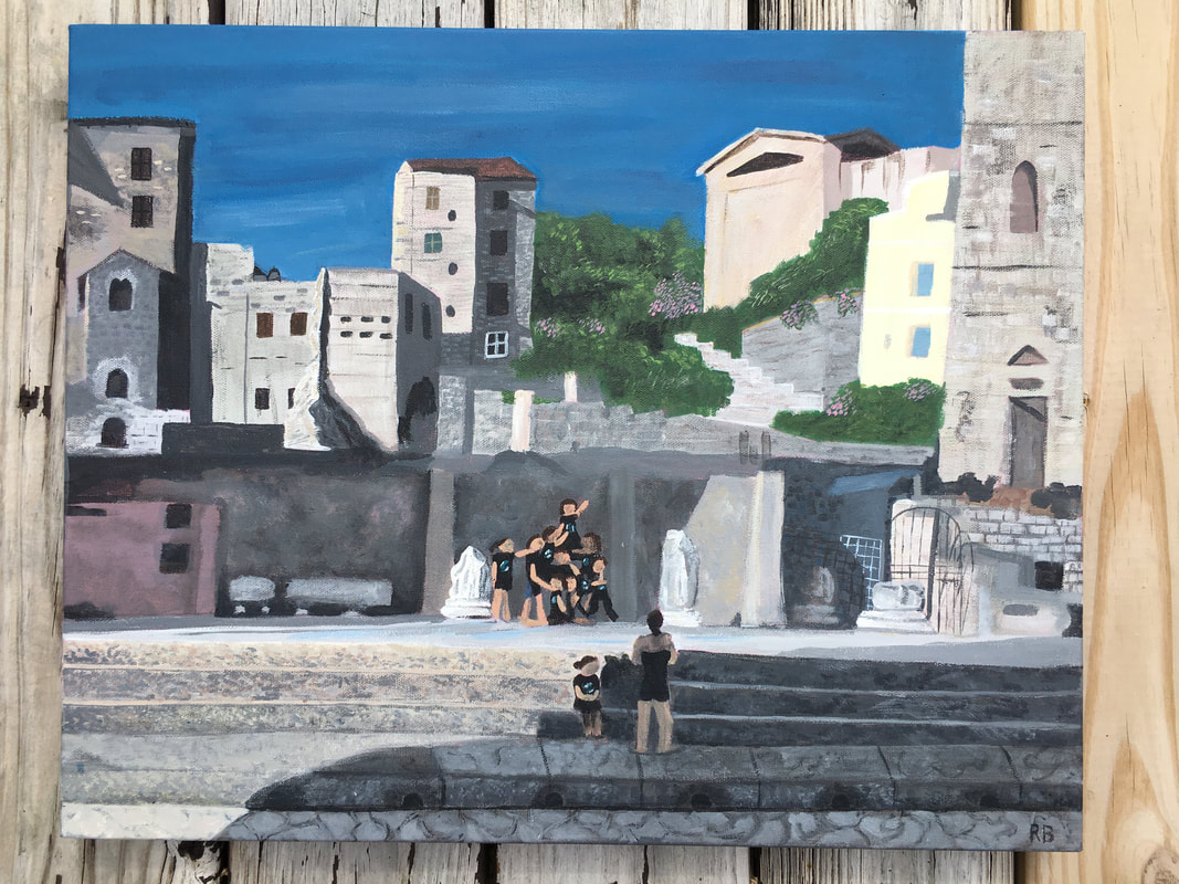
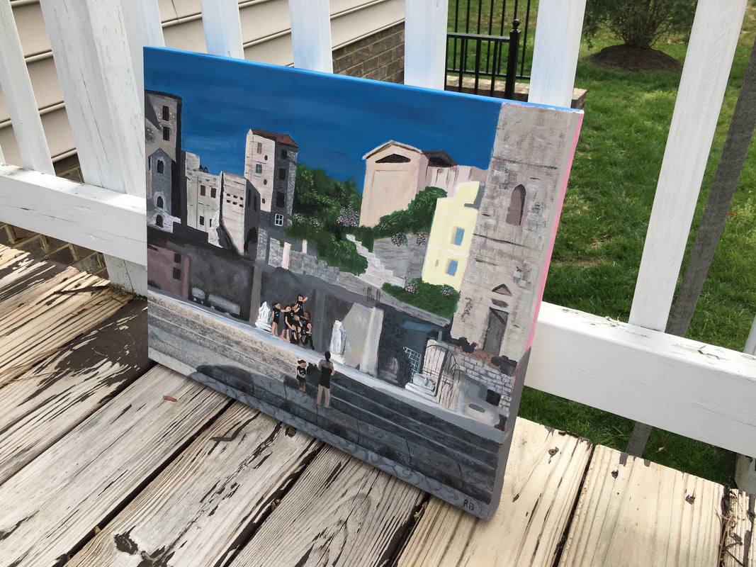
I haven't posted my progress posts yet because I still need to add photos to the drafts, but here's the final piece! I'm not mad at how it turned out. The piece is 16" x 20" so it's kind of big, and I wish I had been able to add more detail into it but honestly mixing the colors took so long, especially since most of it was rock or cobblestone with a ton of colors. This is my first painting on a thick canvas so I'm not sure how to resolve the sides yet, so please let me know if you have any suggestions! I'm also wondering if I should go back in and add more details to the people's faces, but I feel like the detail may seem out of place. The sky looks a little funky from close up, but from far away it looks accurate so I'm not sure if I should blend it out more. 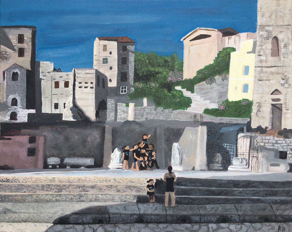
5 Comments
Doing the grid for this was SO HARD. To be fair the picture I used was not the right size for this canvas so my plan was to just paint it to scale and then add extra sky up top where my reference photo ended. I don't know why it ended up being such a hot mess (spoiler alert: it's because I can't do math for the life of me) but I somehow ended up fitting the whole image on the canvas, meaning I must have stretched it one way or another. I only realized after sketching the whole thing out, but by then it kind of looked pretty okay so I just went with it. I picked this project bc I knew it was going to be a challenge bc I haven't worked with paint in so long, but I'm already over it whenever I paint I feel like I revert back into my 6th grade self and all my forms and colors look like they're out of a crayola box. I hope adding detail will make it look more on the realistic side. |
Ria BakshiCheck out what I'm currently working on by clicking the PROCESS button! Archives
December 2020
Categories |
 RSS Feed
