|
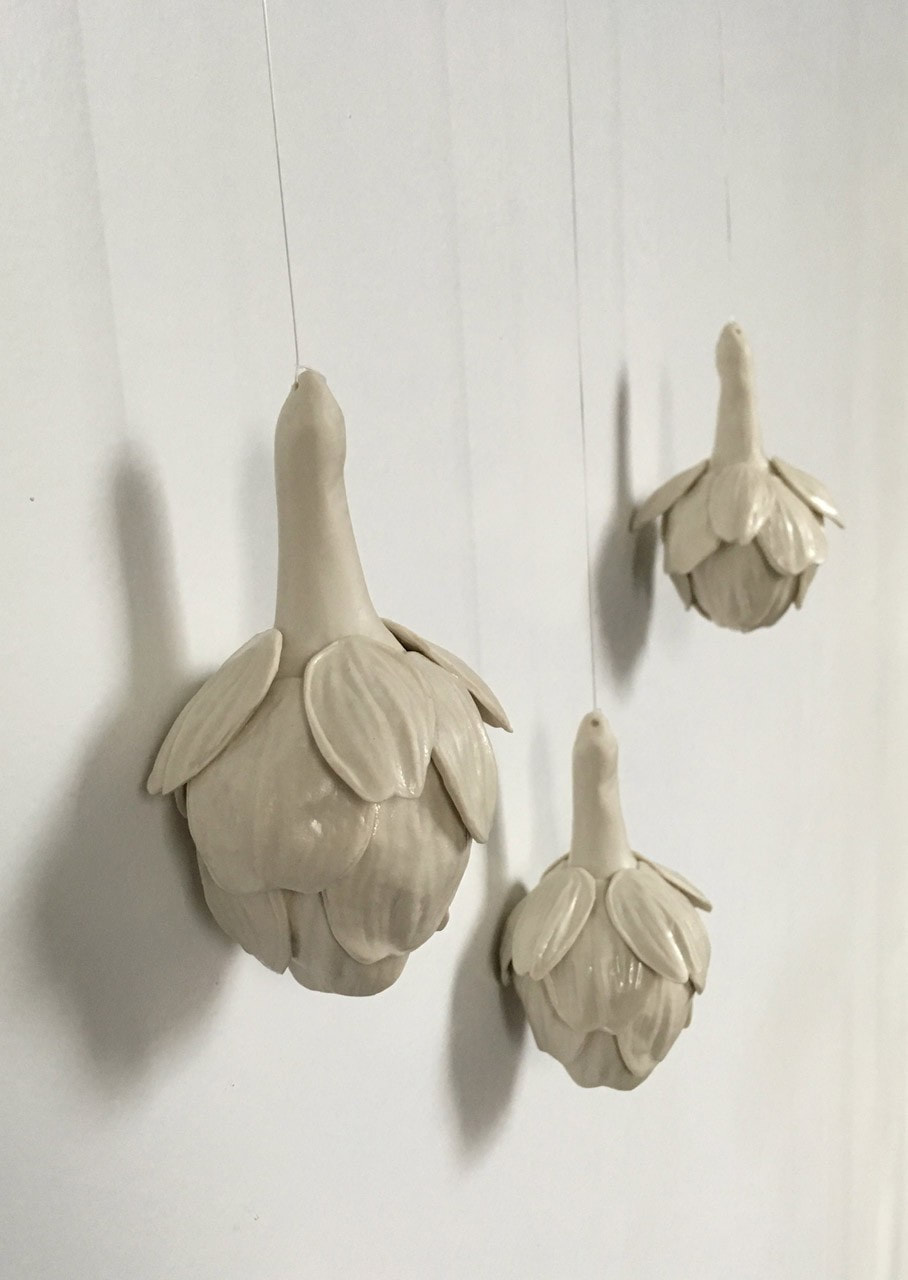
True to 2020 fashion, I "visited" an online exhibition for this quarter's experience post! I visited the Westmoreland Museum of Art located in Pennsylvania, and more specifically Sarah Tancred's exhibit "Heirloom". What originally drew me to her work was the simplicity of it, monochrome and repetitive, which reminded me of my own work. Her work focuses on the socially constructed gender role of women, and how the role has evolved over time and has been informed by several different spheres of life from advertising to everyday objects. Most of her work is sculptural, and the work exhibited at the Westmoreland is primarily cast porcelain and investigates the concept of "invisible labor" that women are responsible for around the house. She focuses on everyday objects that were specifically common around the house in the post WWII era, which I find to be very impactful. Here are a few of my favorite pieces exhibited below:
After a little outside research, I learned that in order to make porcelain pieces you have to create a mold, and while Tancred's exhibit does not explicitly explain this process, you can tell that the repetitiveness in the pieces is definitely attributed to the use of a mold. I really love how simple and monochrome the work is, since the plain-ness of the work really addresses the content of the work and how meaningful and impactful actions (represented by the quantity) can melt into the background of daily life (represented by the white). Honestly, visiting a virtual exhibit was easier and more valuable than I had originally thought. It is definitely missing the impact of scale which you would better experience when visiting in person, but there is also a certain beauty to seeing the pieces captured on camera in exactly the way the artist wanted the pieces to be viewed.
0 Comments
This lecture was interesting even the second time around, especially since it was a nice refresher of this history of Japanese aesthetics and all the people and cultures that have influenced it over time. The presentation also connected back to the Lunchtime Lecture from a few years about Wabi-Sabi, and I felt like it furthered my understanding of how the Japanese viewed beauty, especially in relation to architecture and how spaces were designed. To them it was imperfect and real, and it’s very similar to what my own definition of beauty has evolved into. I started a bullet journal this summer, and I had originally been very precise with it and tried to make it as aesthetically pleasing as I could. But after a while, journaling in it and decorating spreads began to feel like a chore. So, I decided to not focus on the big picture and try to decorate each part of each page to make one cohesive spread weekly, but rather just use it as the days and week progress, in whatever way it works best for that day. After switching over, stepping back I realized that the pages when all filled up, I still found them beautiful because you could see the work but into each part, even if the spacing was wonky and the headers didn’t line up.
Overall, I really enjoyed the lecture, and I want to know more about how Japanese aesthetics evolved over the years, as we mostly focused on how Japanese aesthetics influenced the east and what Tanizaki, a Japanese novelist, thought about western aesthetics and aesthetics in general. What I’m taking away from this lecture is a new perspective that can be turned into a new style, where I embrace more unmethodical techniques. This lunchtime lecture was different from all the other’s I had attended since it was a more informal discussion between a group of prior Maggie Walker students, instead of a speaker who had more of an intentional and directed message. I really appreciated the honesty in their answers; it didn’t feel like they were trying to convince us to all go to art school, which was what I kind of expected. I learned that VCU arts is a better program than I had originally thought, with lots of resources and studio space. People are at all kinds of different artistic levels when entering art school, so at VCU all first years take AFO, which introduces them to all kinds of different materials and art “foundations”. While some of the speakers said they benefited from this experience, others said they kind of felt like they were wasting their time learning basics they already knew and didn’t end up changing their mind about their major. Overall though, I feel like the program has good intentions and is a good idea.
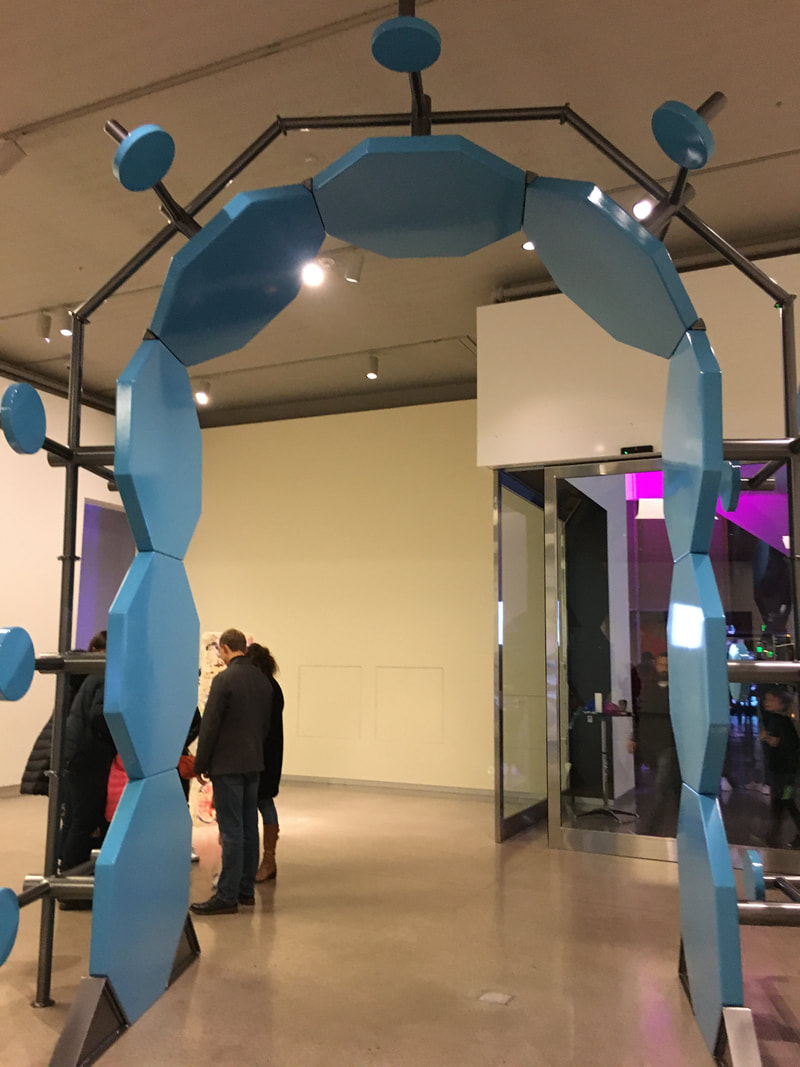
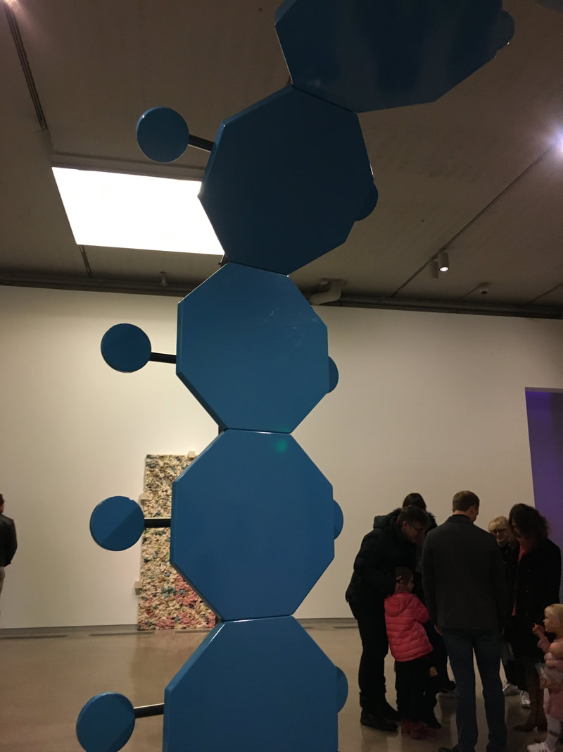
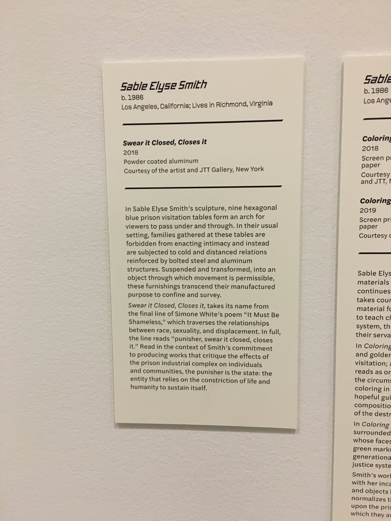
I don’t plan on going to an art school at the moment, but I still had one really big takeaway from this lecture- you can harass your college for financial aid! I honestly didn’t know that was a thing because in my head right now colleges are all powerful institutions, but Lily May and Alex’s advice was to go to the financial office and just ask for more financial aid, and if they say no, go and ask again. In Alex’s experience, it's also how she was able to study abroad for a little bit which is something I definitely want to do. Overall, this lunchtime lecture was really informative, and I appreciated getting to hear about art school but also just about college life from real students. I went to the Fall Art Walk tonight and it was literally so cool!! I somehow just didn't know that First Fridays were a thing before learning about the Fall Art Walk, but I'm already excited to take my family to the next one. We visited VCU's ICA, the ADA Gallery, and , the Black Iris, and the 1708 Gallery, and I saw things in each that I really liked. The first was a sculpture at the ICA. While it didn't visually appeal to me that much, I loved the content behind it, and I feel like it really connects to the sculptures I've been making. The piece is a giant archway made out of prison tables, and I interpreted it as being about how in their standard setting they are used to divide and separate families, while in this position they are a pathway instead. Coach Hall recommended to me that in the future I should consider breaking my work down into just being about the architectural elements in my sculptures; the arches, the stairways, the balconies, and this piece kind of gave me an example of what doing so could possibly look like.
I also loved the exhibit up at the Black Iris. The work was abstract and colorful, but still sophisticated and refined and kind of gory. It's a far stretch comparing it to my summer drawing, but something about the colors and materials just clicked. I also love how the abstract forms all intertwine, kind of like a mind puzzle. Seeing this piece makes me want to do a large abstract drawing in oil pastel. I don't know what direction I would take my own work, but seeing this piece also gave me a starting point by showing me one way I could possibly elevate my work. 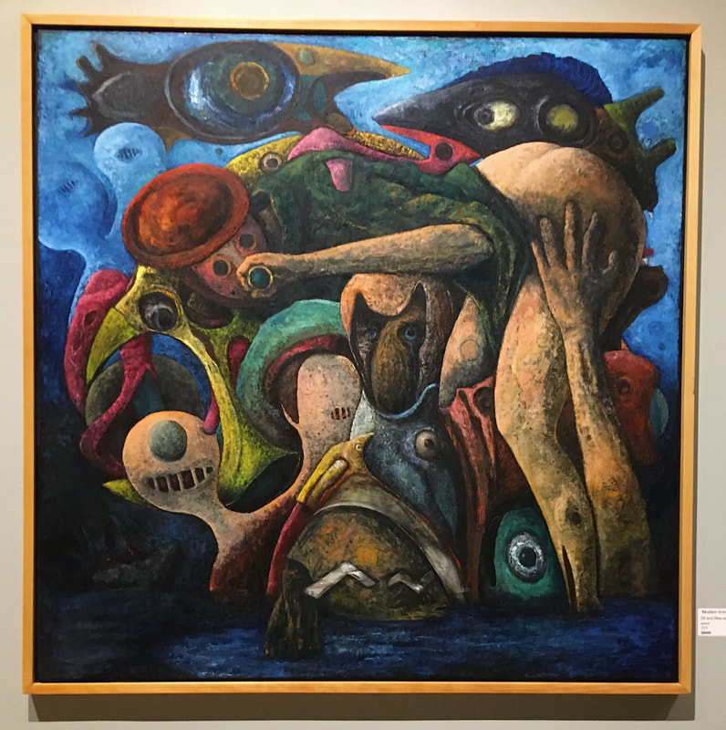 "Modern Immigration"
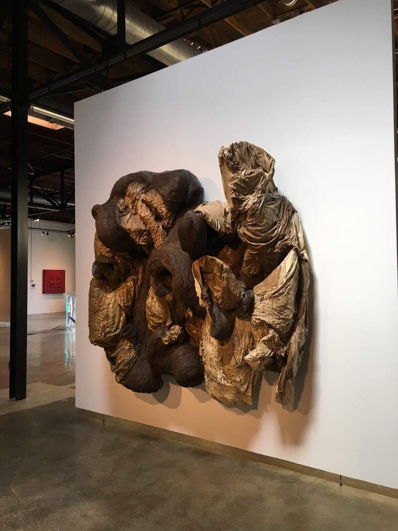
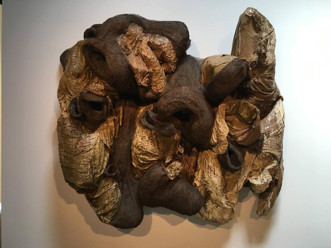
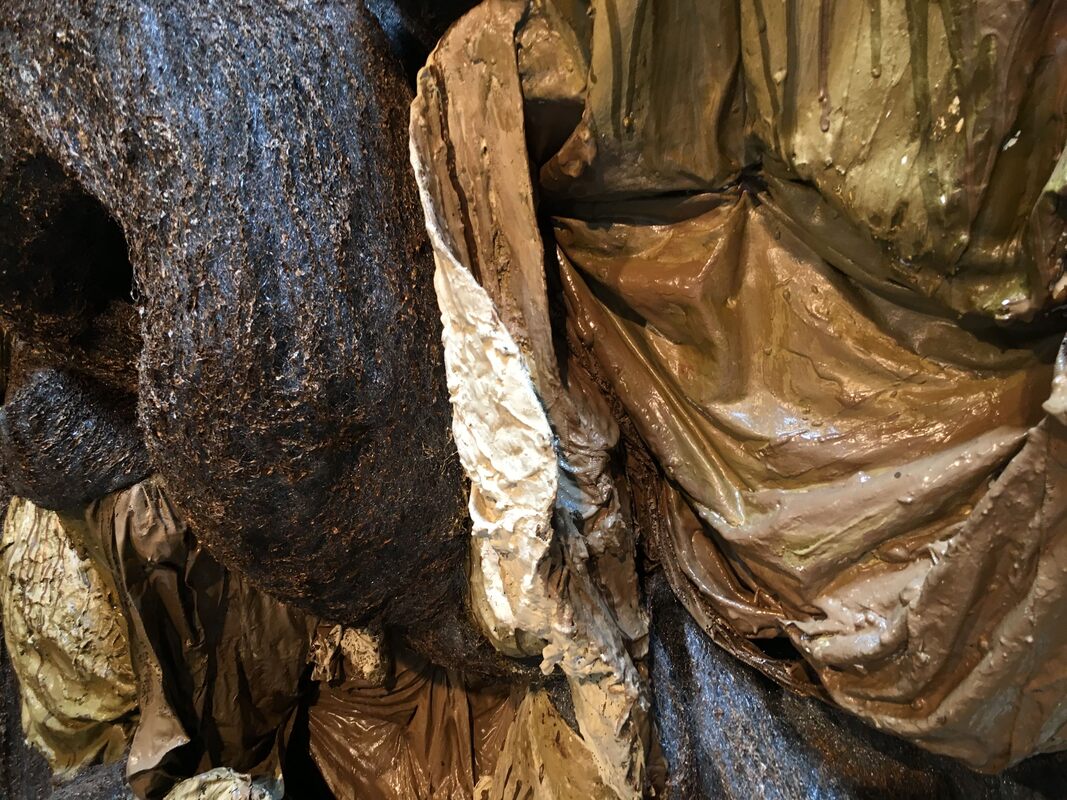
Last month we visited the Try Me Gallery, which is a restoration process/private collection of piece. The collection is held up to museum like standards; with a standard 45 degree temperature, constant humidity, and light filteration devices. Since it is a private collection, unlike other galleries we have visited, this one wasn't open to the public; we had to get special permission and were lead by the registerer of the collection. During the visit, we jumped from topic to topic as we went around and discussed each piece. The weirdest thing about the gallery was that none of the pieces had placards up with their titles and artists, so for every piece we had to either ask, or just take a picture and look for it on the website later. Overall, I had a really great time at the gallery. It was really interesting to see all kinds of pieces in one space, not categorized by style or medium or year. Walking around, I noticed how different pieces were mounted and displayed- some on pedestals, others flush against the wall, and some taking up space in an installation kind of way. I think seeing the size of the pieces are what inspired me to go big with my sculpture. My favorite piece was this large, kind of ugly thing that looked like a mismatched fluffy comforter tacked to the wall. It seemed far too heavy to be pinned up to the wall, and I was intrigued by how it managed to hold its own weight. This is what inspired me to create a larger piece that regardless of its size, still stood up in an interesting way. Its yet to be seen if I actually achieve this but fingers crossed!
 I was so sad to miss this final Lunchtime Lecture of the year! After learning about Mr. Freyer, I am very interested in the way he "creates art". I put that in italics since it is debatable whether he creates art or not, and I'm not sure what my opinion of the answer is quite yet. He calls himself a "recovering conceptual artist", which confuses me since I would still consider him a conceptual artist- I'm not sure what other category his art would fall under. It almost seems to me like he's not an artist at all; instead, he's taken a step back from being an artist and is now some kind of keeper of art, questioning what is allowed in and what isn't. While he asks big questions about what art is, I appreciates how he makes his projects more digestible by naming them plainly, like "Free Ice Water" and "All My Life for Sale". I understand that in his work he manifests meaning into ordinary objects by enriching them with conversation and consequently with meaning, but I wonder if he would consider them art if the viewers did not know the history behind the piece. Essentially, my question is asking if its enough to have faith that their must be some history behind the object, or is knowledge of the project essential. For example, from his Free Hot Supper project, would the project's meaning and content be sufficiently expressed if a viewer just saw different types of chairs surrounding a dinner table, or from his Free Ice Water project, would it be enough for the viewer to simply see the empty jar with the trinkets inside of it, not knowing that they were donated at the end of a conversation? I think this is kind of a "If nobody heard the tree fall, did it really fall" kind of question, but it made me think. I think at the end of the day I would consider his projects art, because even though I'm not involved in the process of enriching the objects with meaning, they still stimulate my mind and in a way force me to have a conversation with myself. Personally, I can't see myself creating any art of this type in the future, but I would love to take part in projects like these as a participant; it seems like a great way to gain a deeper understanding of the piece's message and also to just interact with the art community.
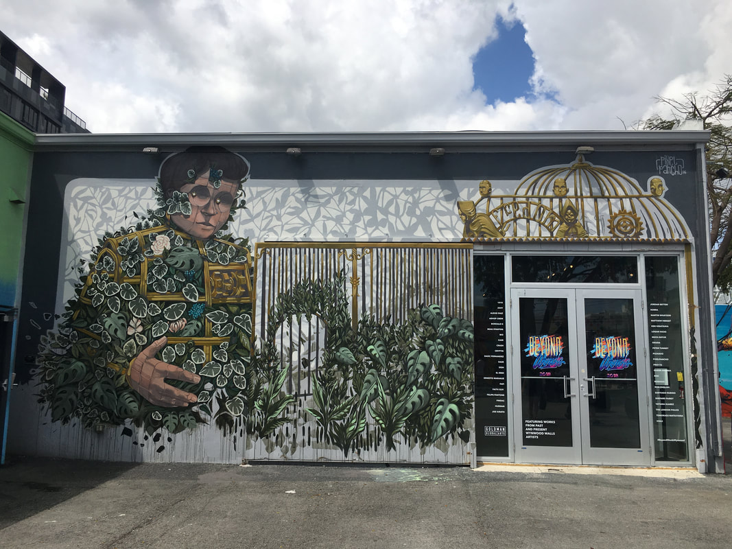
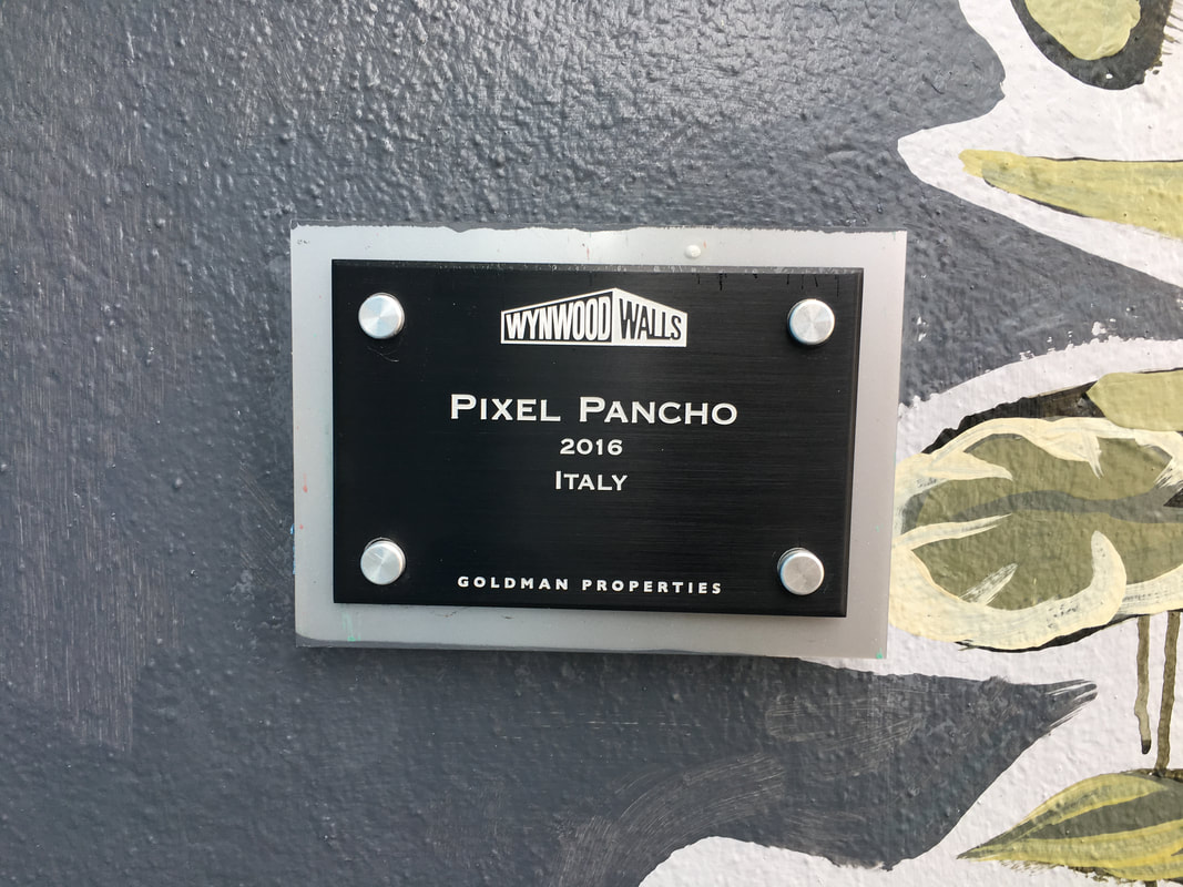
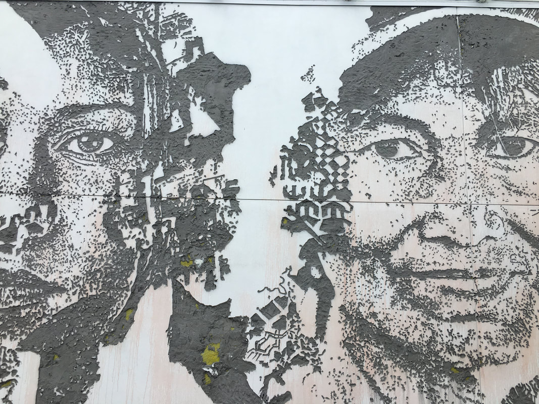
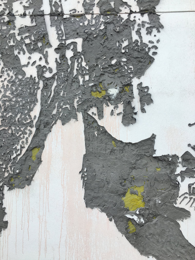
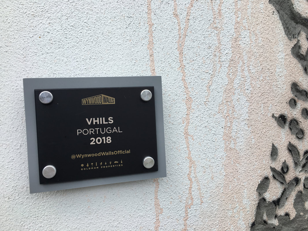
This spring break, my family and I went to Miami, Florida! It was a really good time, and on our second day there we went to see the Wynwood Walls. The Walls are essentially large warehouse buildings without windows, and the sides of the buildings serve as giant canvases for graffiti and street art. Tony Goldman, the creator of Wynwood Walls, wanted to create a place that people would gravitate to, would increase pedestrian interest in the area, and would also lend more attention to the genre of street art, which he believed was under appreciated. 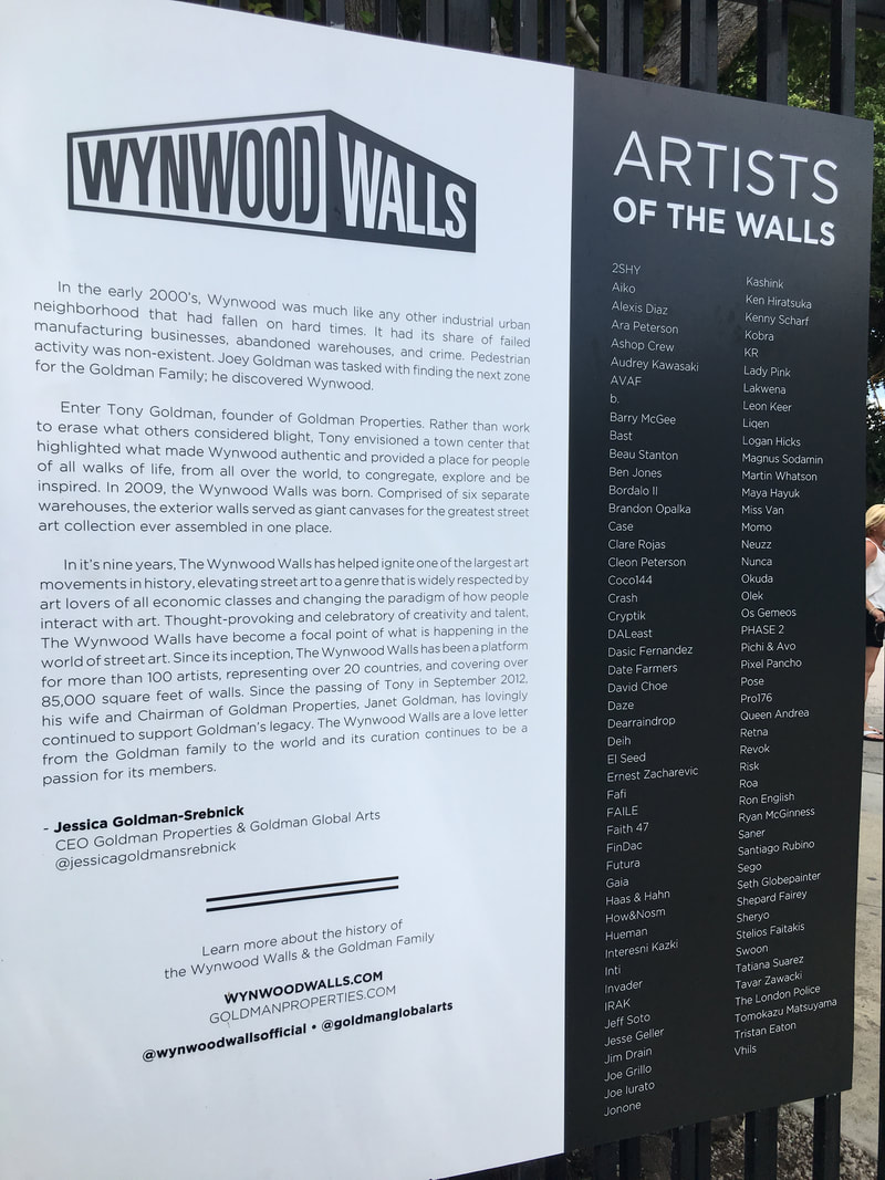 Inspiration!
Sasha Waters Freyer Reflection
This lunchtime lecture felt kinda different from ones in the past; instead of talking about the history of the art form, like comic books, we discussed Freyer’s art process. I always love hearing about artist’s process because it is easy enough to analyze work by yourself, but only the artist knows how they created the piece and what their thought process was.
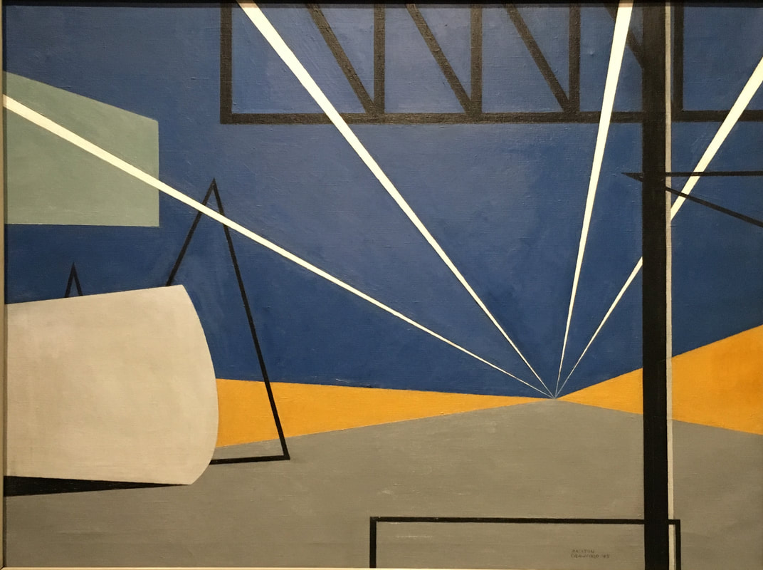
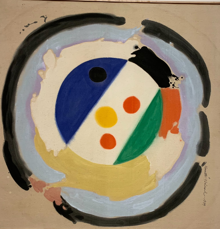
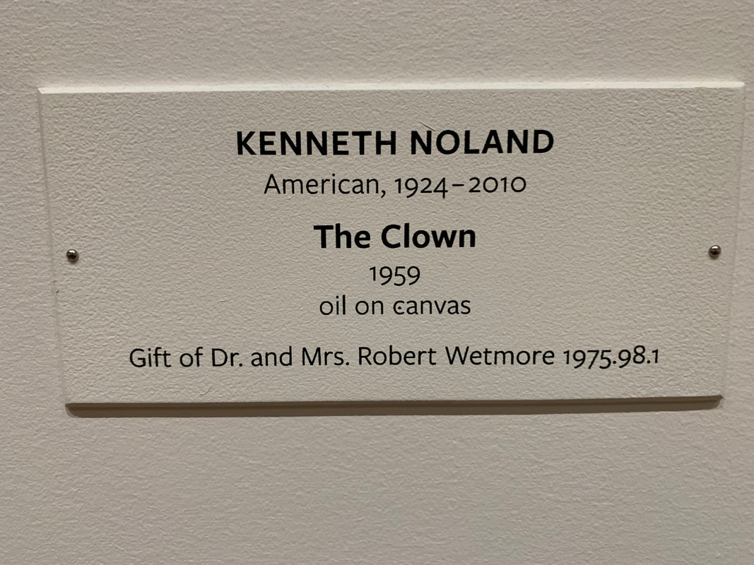
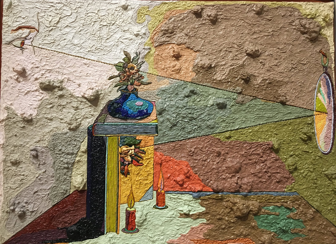
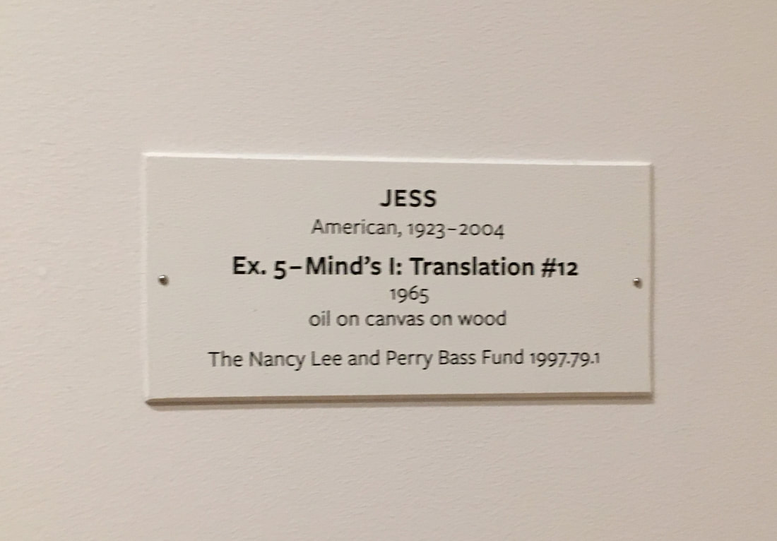
A little summary about Sasha Waters Freyer- she is the Department Chair of Photo/Film at VCU, and creates her own film projects on the side. She enjoys creating documentaries, and her film Gary Winogrand: All Things are Photographable won a Special Jury Prize at the 2018 SXSW Film Festival, and will be aired on PBS. She also makes short, experimental films. These films usually end up being unresolved, and don’t really tell a story; instead they organize shorts artistically like a poet would compose lines, experimenting with shots like an artist would experiment with material. I really love the concept of experimental films- they remind me of the practice painting we did for our AbEx pieces. The clip we watched was from her short film “Respiration”, which I’ve linked down below. The scenes in the short were surprisingly not as modern as I thought they would be; I was expecting high quality clips with music and maybe some fun lighting. Instead, the film is in a way a digital collage, with clips that Freyer filmed and also old archived images and silent films. She opically reprints them, which is when you digitally copy film/images. While most of the video had a soundtrack over it, some parts were highlighted with sound effects, which she also records herself. I thought it was really interesting that there were no words in the piece where the speaker is being spoken to, and is rather in the background while the images speak for themselves directly. I was expecting the lighting to be manipulated more, or for some shots to be taken from odd or extreme angles, but I was surprised by how head on most everything was filmed, which gave the piece a very calm vibe that I enjoyed. My favorite part of the lecture, and in a way the most consoling part was when she talked about her process for the experimental films. While for the documentaries she has to plan and do lots and lots of research and work with other people to figure out when and how things are going to get done, with the experimental pieces she just films and gathers materials whenever time permits and something speaks to her, and then she puts it together when she gets a chance. And since they’re not meant to be final, finished, and resolved pieces, then she can move on whenever she feels like she's done with the project. It reminds me of how I created a vlog after my Hawaii trip and its not chronological at all, and is really more a collection of pretty scenery. I think in the future I’ll definitely try my own take on these experimental videos, especially since I enjoy editing. Abstract Expressionism All the pieces I picked were made using oil on canvas, but it's interesting to see how each piece still differs from each other. The subject is apparent to different levels in each piece, and that was the most interesting thing for me to try to gauge when seeing the AbEx pieces in the museum; can I tell what the subject is? The pieces I found the most interesting were one's that I could either feel what the subject was through the the use of color and/or shape, and the ones that seemed to have something depicted within the paintings. The piece "JESS" is an example where there is clear symbolism and the subjects are clearly visible. For example, it seems as if there is a vase on a stack of books on the table, candles on the table, and a mirror off to the side in which a face is looking into from across the room. However, the perspective and chunkiness of the painting add what seems to be another dimension on top of the skewed perspective, which kind of reminds me of Paul Cézanne. My favorite of the AbEx pieces I saw was the Lights in the Aircraft Plant piece by Ralston Crawford. Before even reading the title, which gives away the subject of the piece, I could tell that the piece was depicting something industrial or mechanic because of the color scheme and the use of black lines in rigid shapes. This piece gave me ideas for what I want my AbEx piece to accomplish: like James McNeil's Nocturne In Black and Gold: The Falling Rocket (which isn't an Ab Ex piece but still), I want my piece to be based off of an event or scene and to depict that scene in a way where the color scheme and shapes are the most prevalent things in the piece. I don't know yet if I want to add texture yet for sure or not, but a combination of piece one and three down below is the direction I am heading in. 1.
2.
3.
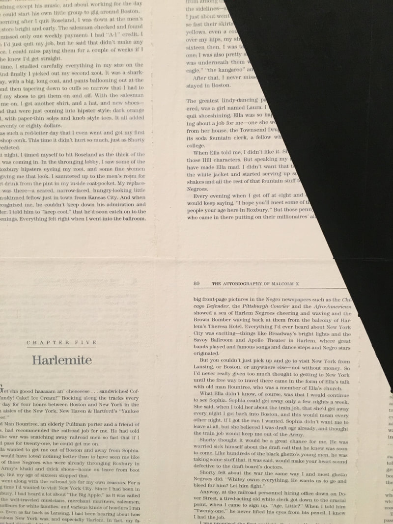
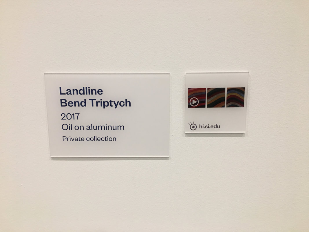
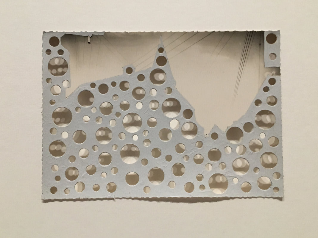
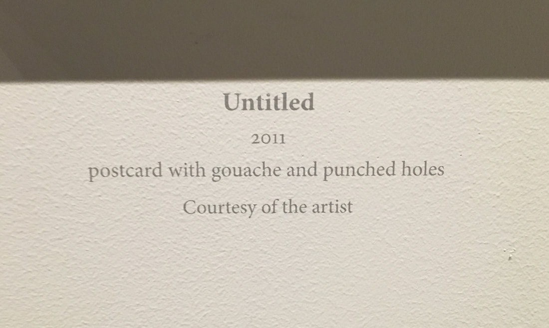
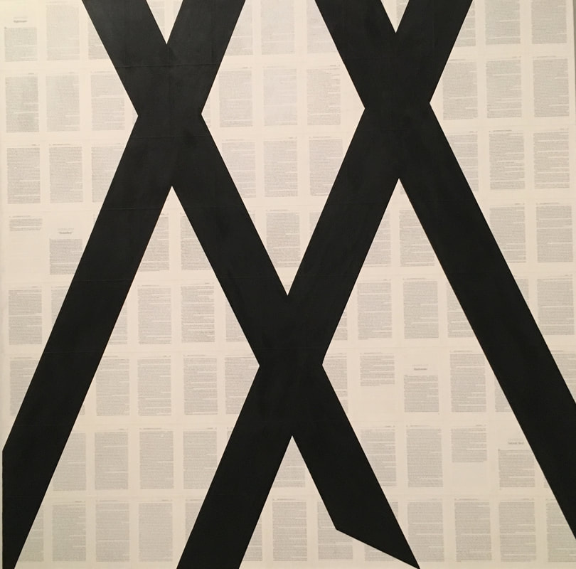
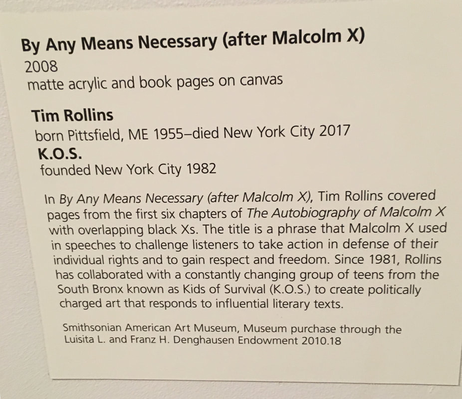
Play Page Inspiration None of these pieces are similar to the others, which is a part of this assignment that I really enjoyed; some of these pieces are ones that i would like to imitate, while others are ones that I like the idea behind. The first piece by Sean Sully gave me Abstract Expressionist vibes, and I thought it was really interesting how he used oil on aluminum, which I have personally never seen before. The piece on the right hand side of the three reminded me of the inside of a geode, which I used to love as a kid, and I liked the use of more muted colors that were still close to primary colors. Trying oil on different mediums is definitely something I want to try in the future. I really loved piece number two, Untitled. It was displayed alongside another similar piece, and both of them together allowed me to derive what meaning I got from it. When I first saw it, I loved how small and simple it was, and how the colors were so peaceful. Upon closer inspection, I realized that it was actually a postcard that had been painted over, so I wondered about what kind of scene must be hidden under the paint. And lastly, the hole punches reminded me of Howardina Pindell, and so I associated the holes with people and interconnectedness. After fully processing the piece, I came to the conclusion that I though it was about places and locations and experiences and how one person can never know all of the story. I have no idea if this was the artists message and thought process behind the piece at all, but I really liked the idea and was inspired to do the same, as i have a lot of postcards from my travels. I actually did a play page based off this piece, which was harder than I thought because the paint I was using was more opaque than I would have preferred and also because the size of my hold punch I wasn't able to easily get to the middle of the post card, but all in all, I gained something from the thought that went into processing this piece and creating my own version of it. Comparatively, I was attracted to piece number three, By Any Means Necessary, (after Malcom X), in a much more superficial way. Since the pages were actually from the first six chapters of the book, liked the way the pages were used in a meaningful way as opposed to simply being the background. I also liked the simplicity of it; again, I was on the lookout for abstract work that kind os spoke to me, as I have never really payed specific attention to abstract and abstract like work before. Lastly, I liked that the piece had political meaning, which in my eyes always adds more meaning to a work by making it relevant to the real world. 1.
2.
3.
 |
Ria BakshiCheck out what I'm currently working on by clicking the PROCESS button! Archives
December 2020
Categories |
 RSS Feed
