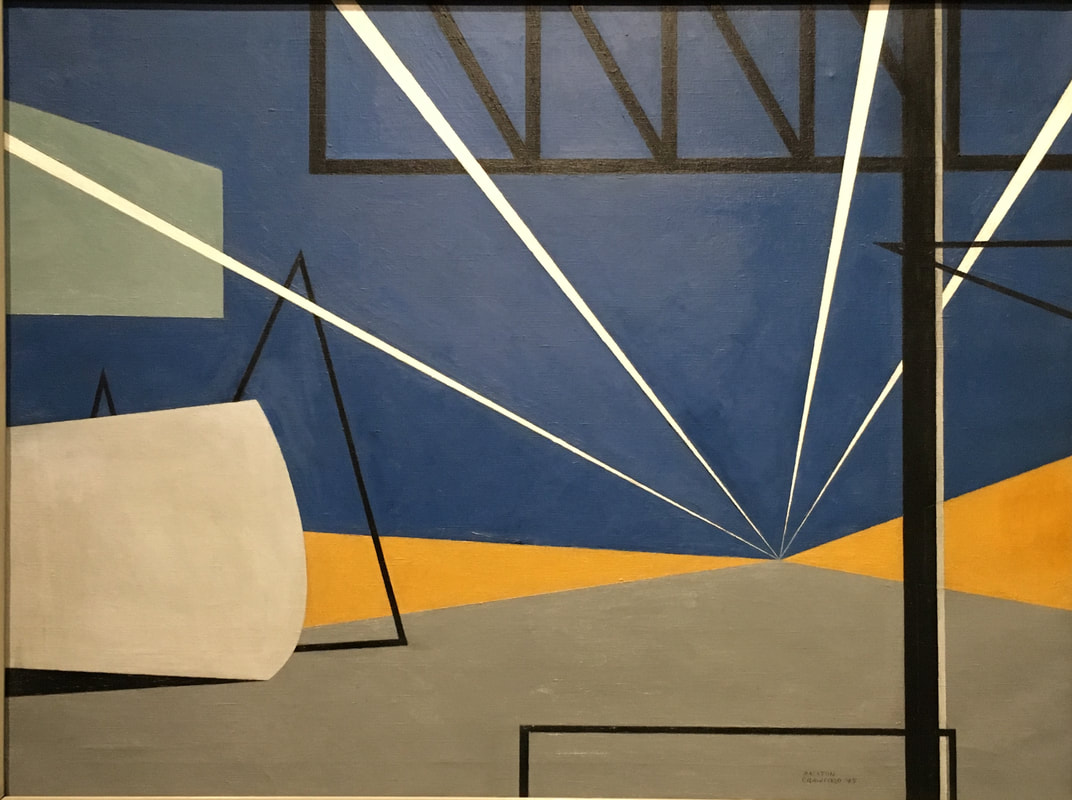
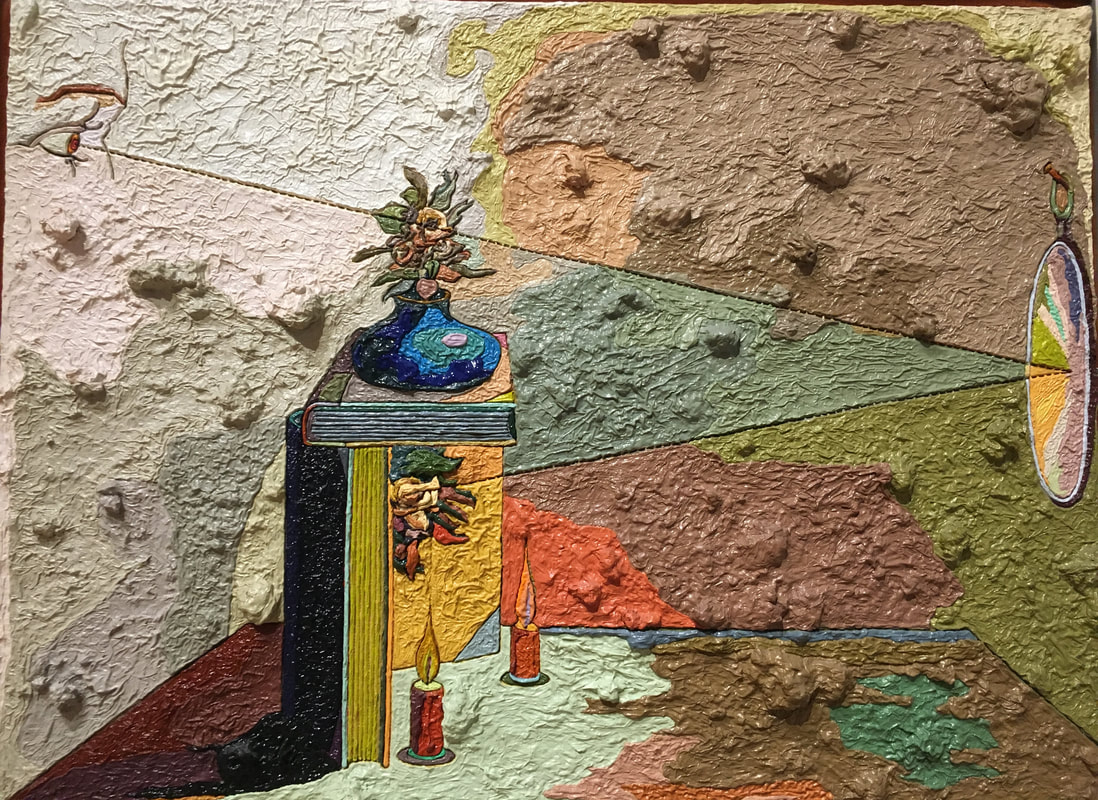
Abstract Expressionism All the pieces I picked were made using oil on canvas, but it's interesting to see how each piece still differs from each other. The subject is apparent to different levels in each piece, and that was the most interesting thing for me to try to gauge when seeing the AbEx pieces in the museum; can I tell what the subject is? The pieces I found the most interesting were one's that I could either feel what the subject was through the the use of color and/or shape, and the ones that seemed to have something depicted within the paintings. The piece "JESS" is an example where there is clear symbolism and the subjects are clearly visible. For example, it seems as if there is a vase on a stack of books on the table, candles on the table, and a mirror off to the side in which a face is looking into from across the room. However, the perspective and chunkiness of the painting add what seems to be another dimension on top of the skewed perspective, which kind of reminds me of Paul Cézanne. My favorite of the AbEx pieces I saw was the Lights in the Aircraft Plant piece by Ralston Crawford. Before even reading the title, which gives away the subject of the piece, I could tell that the piece was depicting something industrial or mechanic because of the color scheme and the use of black lines in rigid shapes. This piece gave me ideas for what I want my AbEx piece to accomplish: like James McNeil's Nocturne In Black and Gold: The Falling Rocket (which isn't an Ab Ex piece but still), I want my piece to be based off of an event or scene and to depict that scene in a way where the color scheme and shapes are the most prevalent things in the piece. I don't know yet if I want to add texture yet for sure or not, but a combination of piece one and three down below is the direction I am heading in. 1.
2.
3.
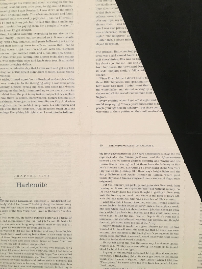
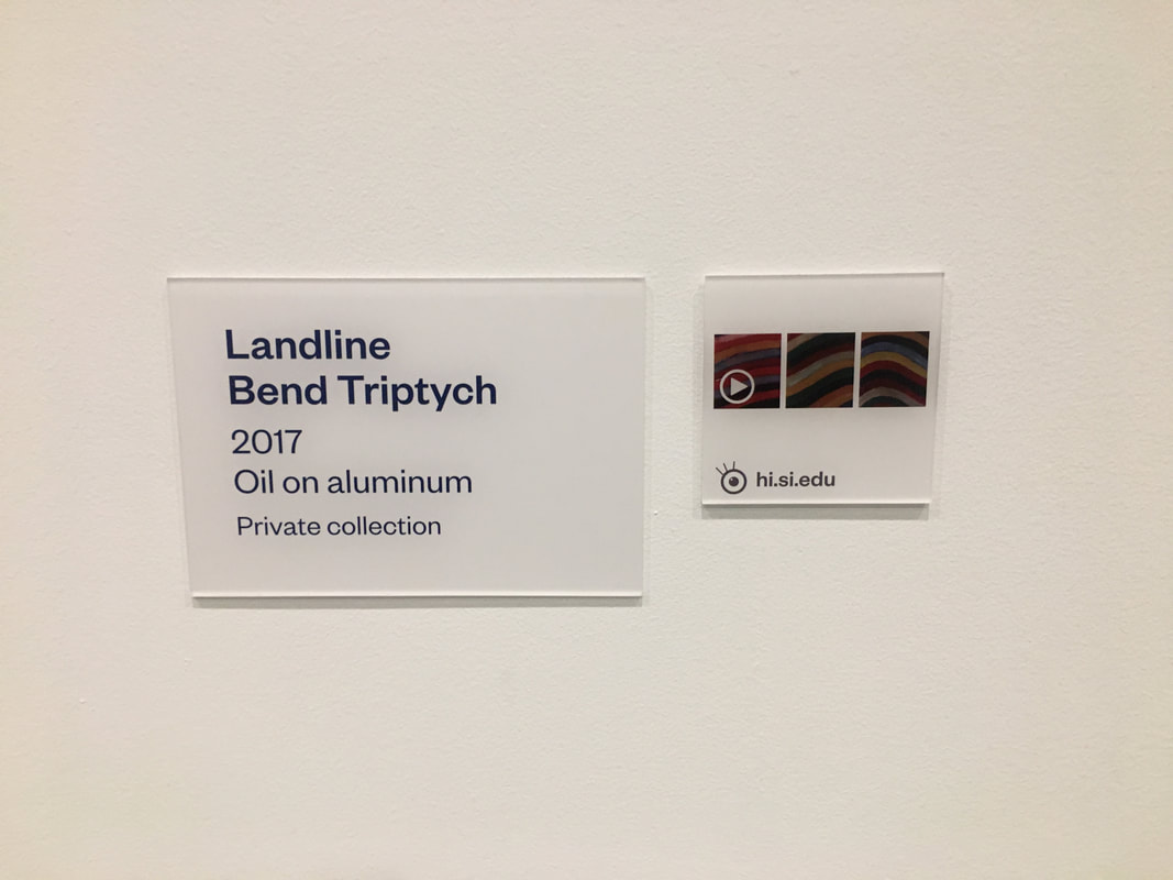
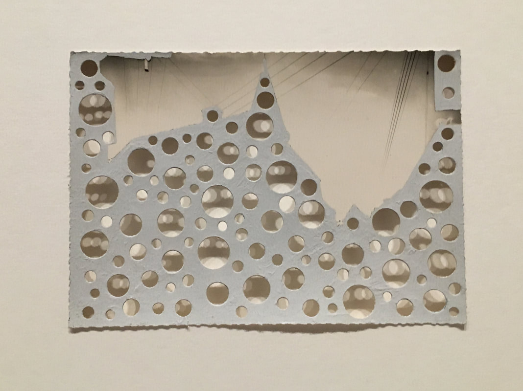
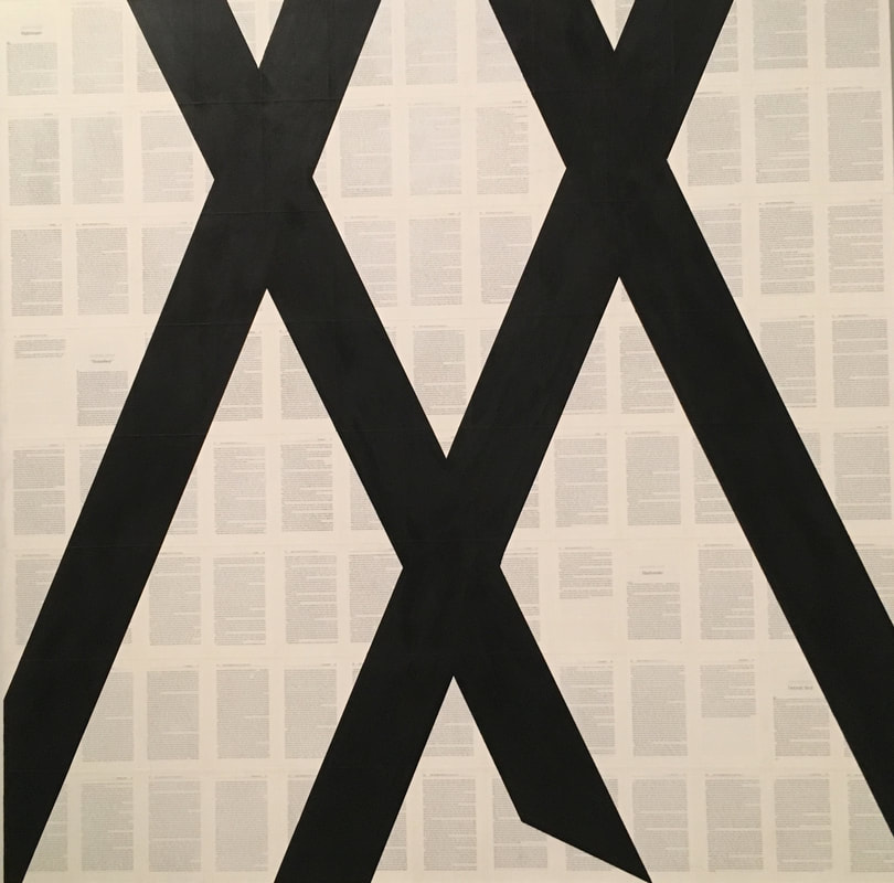
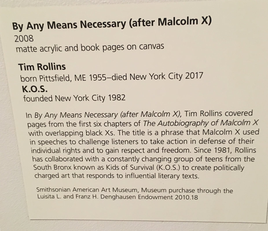
Play Page Inspiration None of these pieces are similar to the others, which is a part of this assignment that I really enjoyed; some of these pieces are ones that i would like to imitate, while others are ones that I like the idea behind. The first piece by Sean Sully gave me Abstract Expressionist vibes, and I thought it was really interesting how he used oil on aluminum, which I have personally never seen before. The piece on the right hand side of the three reminded me of the inside of a geode, which I used to love as a kid, and I liked the use of more muted colors that were still close to primary colors. Trying oil on different mediums is definitely something I want to try in the future. I really loved piece number two, Untitled. It was displayed alongside another similar piece, and both of them together allowed me to derive what meaning I got from it. When I first saw it, I loved how small and simple it was, and how the colors were so peaceful. Upon closer inspection, I realized that it was actually a postcard that had been painted over, so I wondered about what kind of scene must be hidden under the paint. And lastly, the hole punches reminded me of Howardina Pindell, and so I associated the holes with people and interconnectedness. After fully processing the piece, I came to the conclusion that I though it was about places and locations and experiences and how one person can never know all of the story. I have no idea if this was the artists message and thought process behind the piece at all, but I really liked the idea and was inspired to do the same, as i have a lot of postcards from my travels. I actually did a play page based off this piece, which was harder than I thought because the paint I was using was more opaque than I would have preferred and also because the size of my hold punch I wasn't able to easily get to the middle of the post card, but all in all, I gained something from the thought that went into processing this piece and creating my own version of it. Comparatively, I was attracted to piece number three, By Any Means Necessary, (after Malcom X), in a much more superficial way. Since the pages were actually from the first six chapters of the book, liked the way the pages were used in a meaningful way as opposed to simply being the background. I also liked the simplicity of it; again, I was on the lookout for abstract work that kind os spoke to me, as I have never really payed specific attention to abstract and abstract like work before. Lastly, I liked that the piece had political meaning, which in my eyes always adds more meaning to a work by making it relevant to the real world. 1.
2.
3.
1 Comment
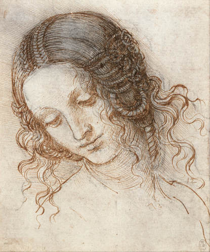
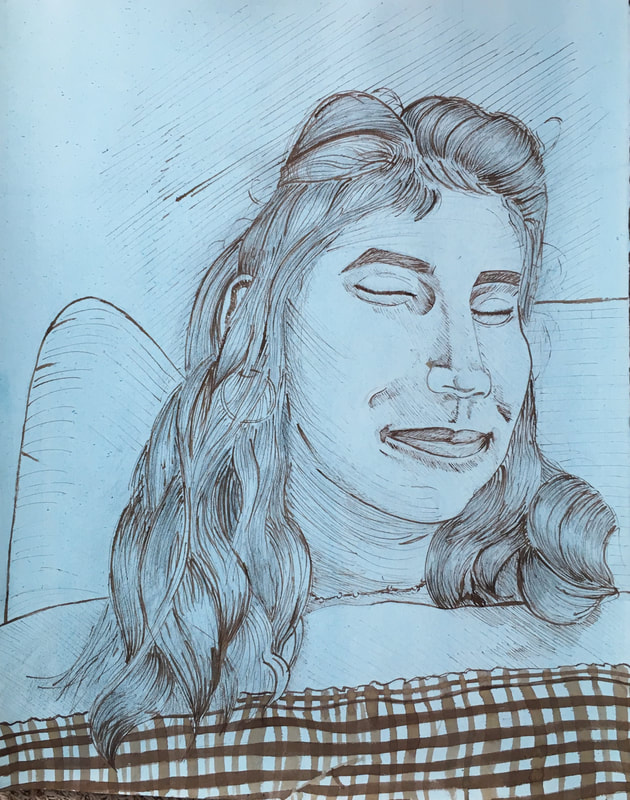
I've been moving along pretty steadily on this project, but I've also been taking a fair amount of ~artistic liberties~ when it comes to drawing the hair, as it is difficult to make out the movement of the hair in the original picture since it's black, and changing the contrast has only been able to do so much. I have also been adding graphite where DaVinci had added charcoal, because I discovered that it goes on much easier on the uneven texture of the paper after the wash than real charcoal does; with that said, I am planning on adding some charcoal on top at the end to increase the contrast.
|
Ria BakshiCheck out what I'm currently working on by clicking the PROCESS button! Archives
December 2020
Categories |

 RSS Feed
