|
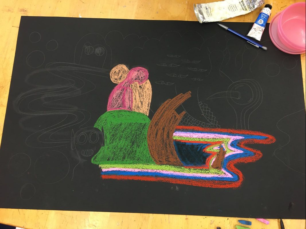
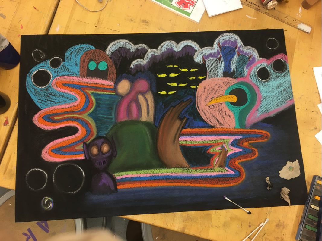
With this project, I wanted to create an almost abstract piece with chalk pastel and black paper. With my last project, I really enjoyed how much planning I was able to put into it, especially since it made the actual production rate so much better. Unfortunately since we have so little time for this project I wasn't able to put in as much planning as I had originally anticipated, but I am enjoying using and exploring this new medium in a more free way. Coach Hall did inform me of an unfortunate fact: using black chalk pastel only dulls the intensity of the colors, and I had already put down large amounts of black since I wanted to create darker shades of all the colors to make the scene more mysterious. My game plan now is to just blend it out and put down different more prominent colors to try and add some intense color back.
0 Comments
Edie Fake was born in 1980, and is an American artist and transgender activist who works primarily creates gauche and ink paintings and murals. He is currently best known for his award winning comic-zine series "Gaylord Phoenix". in 2002, Fake earned a B.F.A degree in Film, Animation, and Video from the rhode Island School of Design. He then worked as a film cutter for several years until going back to school at the Roski School of Art at the University of Southern California. He later became one of 7 students to drop out of the school (later known as the USC7) in protest to mistreatment by administration. In his work, Fake explores identity in the transgender and queer experience. His style is abstract and reminiscent of a fantasy, and he uses this style to redefine historical queer spaces. My response:
This lunchtime lecture was different from all the other’s I had attended since it was a more informal discussion between a group of prior Maggie Walker students, instead of a speaker who had more of an intentional and directed message. I really appreciated the honesty in their answers; it didn’t feel like they were trying to convince us to all go to art school, which was what I kind of expected. I learned that VCU arts is a better program than I had originally thought, with lots of resources and studio space. People are at all kinds of different artistic levels when entering art school, so at VCU all first years take AFO, which introduces them to all kinds of different materials and art “foundations”. While some of the speakers said they benefited from this experience, others said they kind of felt like they were wasting their time learning basics they already knew and didn’t end up changing their mind about their major. Overall though, I feel like the program has good intentions and is a good idea.
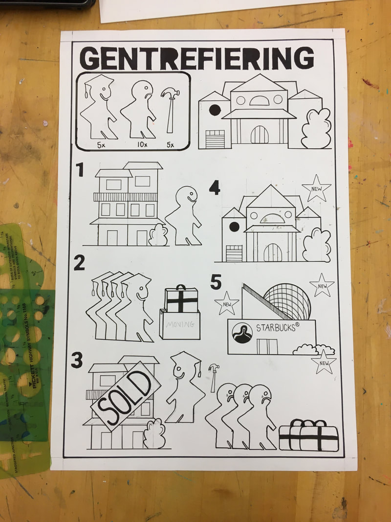
I don’t plan on going to an art school at the moment, but I still had one really big takeaway from this lecture- you can harass your college for financial aid! I honestly didn’t know that was a thing because in my head right now colleges are all powerful institutions, but Lily May and Alex’s advice was to go to the financial office and just ask for more financial aid, and if they say no, go and ask again. In Alex’s experience, it's also how she was able to study abroad for a little bit which is something I definitely want to do. Overall, this lunchtime lecture was really informative, and I appreciated getting to hear about art school but also just about college life from real students. The piece is almost done! The tracing and filling in is my favorite part because it's so easy after all the layout has already been done. I wish I had done this project on a larger piece of paper because I feel like if there had been more space between the steps, it would be clearer that step 3 is one scene that stretches across the entire bottom of the page. The manual is based on Ikea manuals that have no words in order to make them easier to understand, and at the end I was debating about whether to include an Ikea logo on the piece, but then I decided against it because I don't want to draw attention from the real meaning of the piece and make it seem like commentary on Ikea the company itself. I don't love how the title is in Swedish and then there are still English words on the signs throughout the piece, but I couldn't think of a better way to communicate the "SOLD" or "NEW" since the words are completely different in Swedish. In hindsight, I think I should have just kept the title in English because while I thought it would force the viewer to look at it a second longer trying to figure out what it says, I think it just makes it unnecessarily confusing. In general though, I enjoyed the straightforward process of the piece and the clean final product. For my next piece, I want to do something kind of architectural and incorporate graph paper, because I really liked the process of drawing the houses and want to create something more elevated.
I learned how to use the laser printer to make stencils! It's surprisingly really easy; I just drew out the shapes I wanted and colored them in with a sharpie, and then you put them in the printer and it scans them. Then it uploads the scan onto the computer and you can re-position the image and highlight any negative space the scan missed, and then laser print it onto a piece of transparent paper. It all happens in the same place, the scanning and the printing! The stencils I made aren't super clean and smooth, so there are still some shaky edges that become apparent when outlining with sharpie, but they still helps me space things out evenly on the page so I'm glad I made them. Coach also said the printer could be used to burn into wood, which I think would be a super cool way to elevate pen and ink drawings, so I'm going to keep that in mind for future projects.
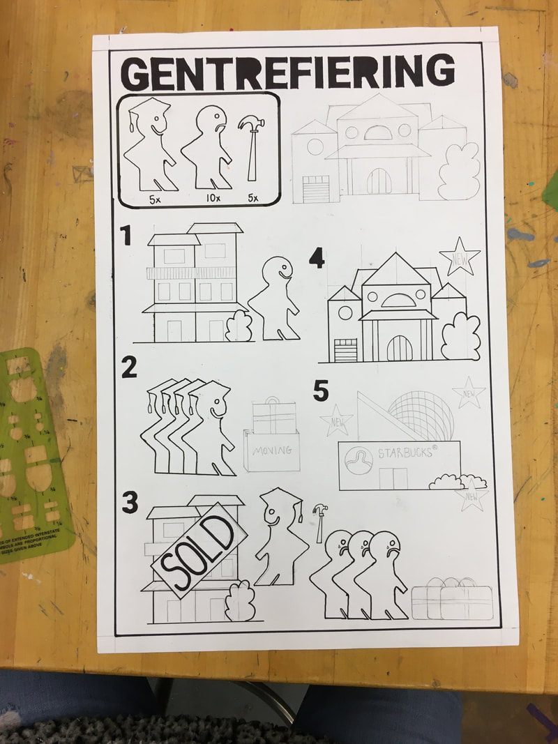
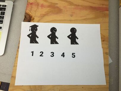
I've just started this project and I already know that it's going to take so much more planning than any of my other projects. I already spent like 2 whole classes just reading about gentrification. I had researched a little about it for a debate case last year but I wanted to delve into more because I know that there are two distinct perspectives about it; some people strongly believe that gentrification is wrong and action should be taken against it, while other's don't see the negative aspects of it. With the piece, I know I don't want to make a political statement exactly, but rather just make something informative. Most of the people I've talked to about my idea for this project haven't known what gentrification is, so I want to make something that is more informative and clean looking, a complete 360 from my previous messy sculptures. I've done some planning in my sketchbook, but for me to like this piece I need it to be as clean and precise as possible so I may experiment with the laser cutter to make stencils.
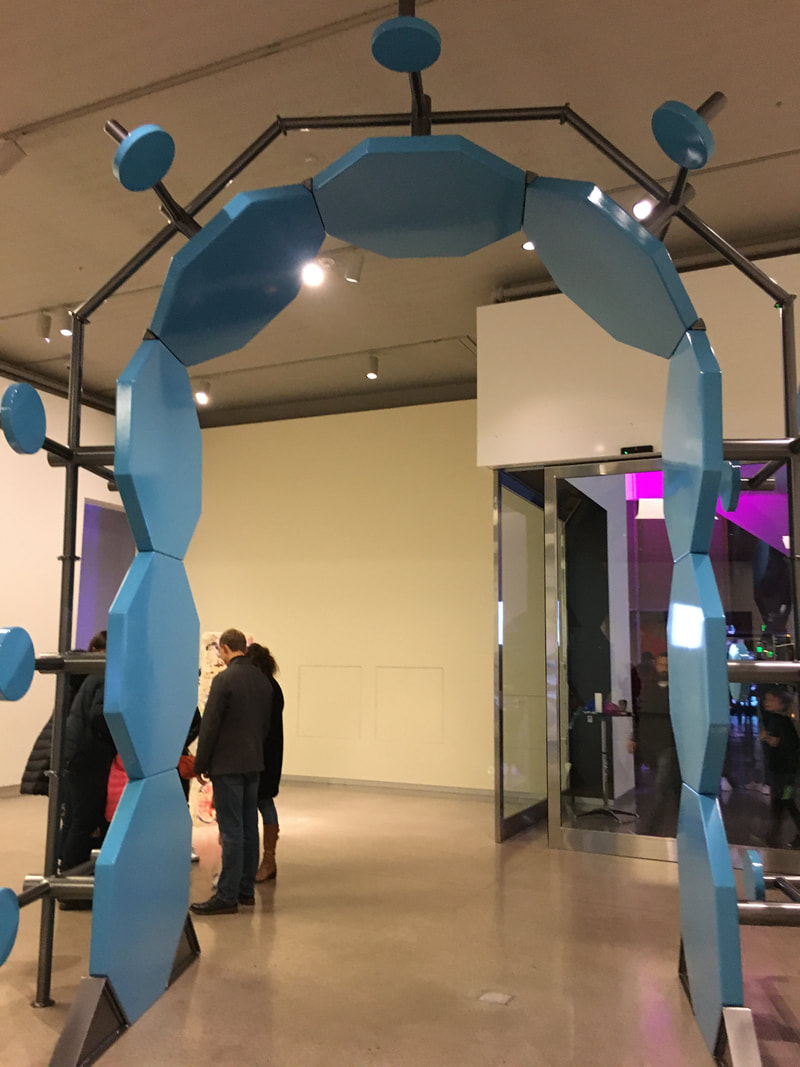
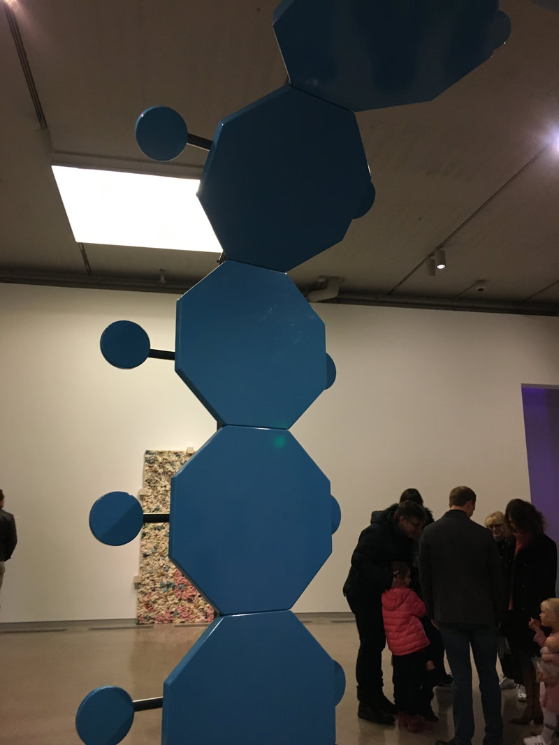
I went to the Fall Art Walk tonight and it was literally so cool!! I somehow just didn't know that First Fridays were a thing before learning about the Fall Art Walk, but I'm already excited to take my family to the next one. We visited VCU's ICA, the ADA Gallery, and , the Black Iris, and the 1708 Gallery, and I saw things in each that I really liked. The first was a sculpture at the ICA. While it didn't visually appeal to me that much, I loved the content behind it, and I feel like it really connects to the sculptures I've been making. The piece is a giant archway made out of prison tables, and I interpreted it as being about how in their standard setting they are used to divide and separate families, while in this position they are a pathway instead. Coach Hall recommended to me that in the future I should consider breaking my work down into just being about the architectural elements in my sculptures; the arches, the stairways, the balconies, and this piece kind of gave me an example of what doing so could possibly look like.
I also loved the exhibit up at the Black Iris. The work was abstract and colorful, but still sophisticated and refined and kind of gory. It's a far stretch comparing it to my summer drawing, but something about the colors and materials just clicked. I also love how the abstract forms all intertwine, kind of like a mind puzzle. Seeing this piece makes me want to do a large abstract drawing in oil pastel. I don't know what direction I would take my own work, but seeing this piece also gave me a starting point by showing me one way I could possibly elevate my work. 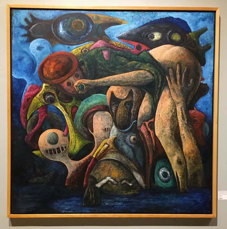 "Modern Immigration"
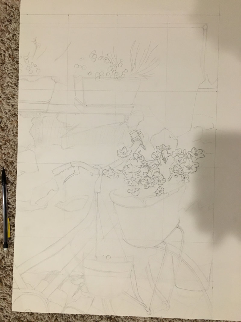
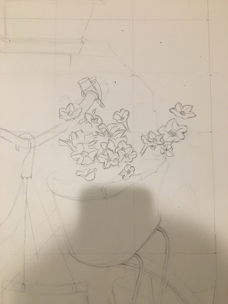
The piece is finished! I learned a lot about creating a "body" of work from this piece. I feel like the pieces are too different from each other to be a cohesive series, but everyone I mentioned that to said exactly the opposite. Over all though I'm glad with how the final piece turned out, and I'm really proud of the fact that I actually finished! If I was to do this project again, I think I would just go with my first piece and work on refining it and making it larger, but I'm still glad I have a series piece in my portfolio. The pink didn't turn out exactly like I had imagined it in my head, but it does the job of emphasizing the negative space in the piece.  My home project is coming along more slowly than I would have liked because I'm really trying to take my time with the underdrawing of the piece before jumping into the color because I know that with a realistic piece, proportions end up being really important. I'm not sure about how much detail I should go into with the flowers because I know that drawing too dark or being too specific may make it harder to color over later. To be honest, I'm also kind of just scared to start the colored pencil because I feel like I won't know where to start. I've watched a few videos but I think I need to do a little more practice blending colors in my sketchbook before diving in. I'm also not sure about if I want to keep the intercom box in the top right corner of the piece or use my artistic liberties and just ignore it. I'll ask the class about it tomorrow during the pre-critique.
Marc Quinn, born in 1964, is a British contemporary artist who specializes in sculpting, installation, and painting. His father was a physicist, and at an early age Quinn was fascinated by his father’s scientific instruments. His work addresses the question of what it means to be human through his use of materials and subjects. He uses a variety of materials from marble and stainless steel to his own blood. Click on the links for more info! Website CV Key Works 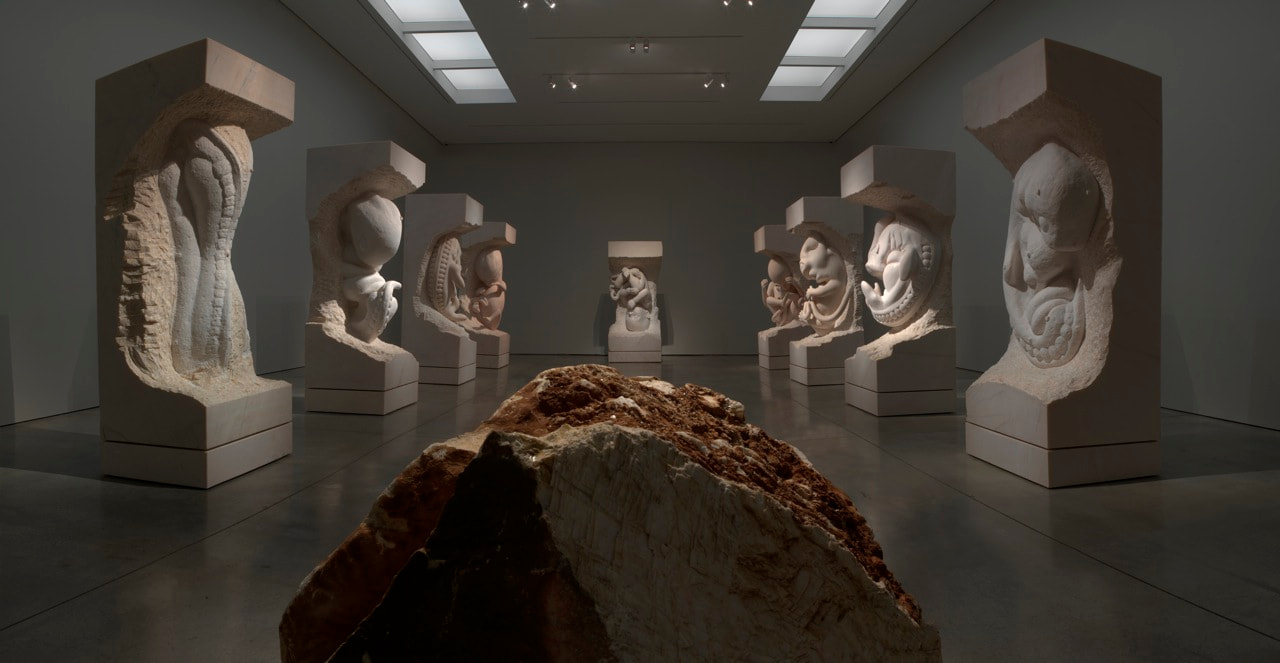 Sculpture, 2005, Ten pink marble sculptures, Dimensions variable This piece struck me as particularly interesting because of both its size and multitudes. The sculpture depicts a fetus each month of development- an example of how Quinn's work brings science into art. I love this piece; it's so simply beautiful, and I'm sure the magnitude of these individual pieces and the sense of them together adds to the pieces significantly. According to Quinn this piece is about "bringing matter to life", which makes sense since the embryo seems to be developing from the marble itself- an interesting connection that goes back to how humans developed as a species. I also thought it was interesting that Quinn didn't make these pieces himself. Instead, he hired traditional stonemasons from Italy who worked under his instruction alongside the use of real ultrasounds. Quinn's main contribution was the idea itself, which surprised me but I later realized shouldn't have, considering how renowned of an artist he is. This piece makes me want to create a series of sculptures even more than I already did. Marc Quinn's Self Portrait Series
I thought this series was so interesting, especially since it is an ongoing one. I love the way Quinn brings together art and science, and in this series particularly I understand how the science adds meaning to the piece. The fact that the sculptures are made out of his own blood are so astonishing to me. Not only do they connect the piece to his experiences at the time the blood was taken but they also communicate a sense of his what his personality is: daring, adventurous, and creative. It also approaches a self-portrait in a much more literal way; since the frozen sculpture needs machinery to stay frozen, it is also a commentary on how man depends on structure to keep himself together and in Quinn's case, also alludes to his history with addiction. |
Ria BakshiCheck out what I'm currently working on by clicking the PROCESS button! Archives
December 2020
Categories |
 RSS Feed
