|
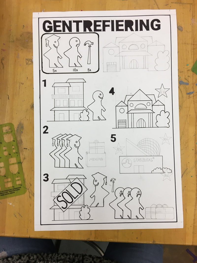
The piece is almost done! The tracing and filling in is my favorite part because it's so easy after all the layout has already been done. I wish I had done this project on a larger piece of paper because I feel like if there had been more space between the steps, it would be clearer that step 3 is one scene that stretches across the entire bottom of the page. The manual is based on Ikea manuals that have no words in order to make them easier to understand, and at the end I was debating about whether to include an Ikea logo on the piece, but then I decided against it because I don't want to draw attention from the real meaning of the piece and make it seem like commentary on Ikea the company itself. I don't love how the title is in Swedish and then there are still English words on the signs throughout the piece, but I couldn't think of a better way to communicate the "SOLD" or "NEW" since the words are completely different in Swedish. In hindsight, I think I should have just kept the title in English because while I thought it would force the viewer to look at it a second longer trying to figure out what it says, I think it just makes it unnecessarily confusing. In general though, I enjoyed the straightforward process of the piece and the clean final product. For my next piece, I want to do something kind of architectural and incorporate graph paper, because I really liked the process of drawing the houses and want to create something more elevated.
0 Comments
Leave a Reply. |
Ria BakshiCheck out what I'm currently working on by clicking the PROCESS button! Archives
December 2020
Categories |
 RSS Feed
