|
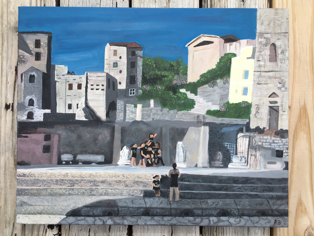
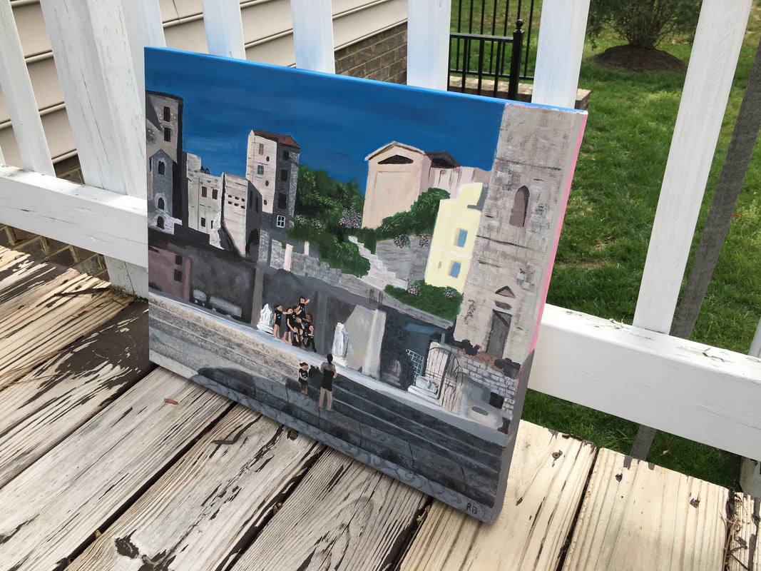
I haven't posted my progress posts yet because I still need to add photos to the drafts, but here's the final piece! I'm not mad at how it turned out. The piece is 16" x 20" so it's kind of big, and I wish I had been able to add more detail into it but honestly mixing the colors took so long, especially since most of it was rock or cobblestone with a ton of colors. This is my first painting on a thick canvas so I'm not sure how to resolve the sides yet, so please let me know if you have any suggestions! I'm also wondering if I should go back in and add more details to the people's faces, but I feel like the detail may seem out of place. The sky looks a little funky from close up, but from far away it looks accurate so I'm not sure if I should blend it out more. 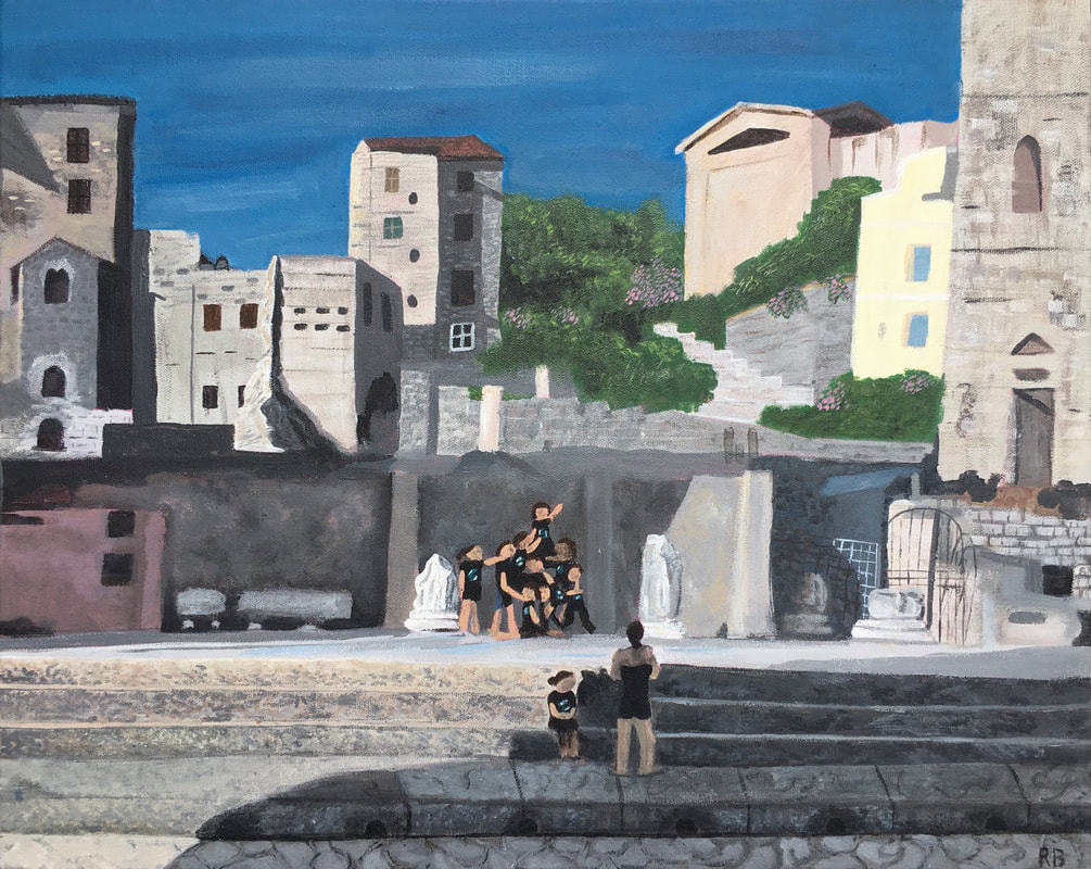
5 Comments
Helen Hall
3/30/2020 09:43:06 am
My favorite part about this piece is the amazing texture you achieved on the buildings and the steps, which is impressive given the scale of the piece. I worked with acrylic on my piece and found it really hard to add detail so good job with all of the detail! Did you have any specific content in mind? I think the buildings stand out so I'm wondering whether the group of people is essential to the content? Composition wise, I think your eye is drawn to the people as they are in the middle, which is good if the content is based on them. I think the hard thing with adding detail to the people is how small they are, so maybe add detail by shaping their legs and arms more to hint at detail without adding in facial features or anything like that. I think it was super ambitious to do such a big piece, but I definitely think it paid off! I think the depth you've created makes the piece pop!
Elizabeth Celentano
3/30/2020 10:37:18 am
I'm really drawn to all of the different types of textures you were able to achieve with the buildings. I like the sky as it is because the piece itself is larger, so you want to focus more on how it reads from far away anyways. I agree that you should try to add some definition to the people, especially their limbs, because they automatically draw the eye. I'm partial to painting the edges of the canvas with a bright contrasting color, like orange, but I also think a gray or blue would work well. As a whole, I think the composition is very strong. I'm sensing that the content isn't as important as the craftsmanship, but I also think that you could focus on the group of people and what they're doing/wearing (a uniform??) to create an overall mood. Still, though, it is a very well-done painting!!
Rylan Karjane
3/30/2020 01:00:26 pm
I really like how detailed your painting is. The texture of the steps, the inclusion little pink flowers, the intricate lines of gate/crisscrossy thing is unbelievable. I also commend you for putting down a base coat of pink, it makes your edges and the places where normally you would just see white, pink, which is so cool and adds a little pop of color and dimension. I think maybe you could alter the people a little bit to make them fit more with the rest of the piece because the rest is so detailed and they are kinda like little blobs of flesh. I think even just modifying the limbs to be slightly more proportional would do a lot. But overall great job.
shreya malani
3/30/2020 01:38:24 pm
YAY! I love it so much and I know how hard you worked on this piece. I think that considering you were working with acrylic, it is amazing the amount of layers that you did to achieve that level of detail. I’d also like to say that the amount of detail is good, because although your people aren’t super realistic, it fits really well with the rest of the buildings. My only critique is that you work a little bit on adding shadows to the limbs of the people and refine some of the edges of the buildings :). Great job
Julianne Zielinski
3/30/2020 05:06:37 pm
This piece threw me back because I remember exactly where and when this is from (': I'm extremely impressed by your perspective, layering, and detail of your piece i LOVE it and I think its super successful. I know you mentioned adding more detail to the people but I think it fits the theme of the piece. The composition flows really well, and my only polish would be cleaning up the legs and back of the person closest to the front of the piece, the older women facing the dancers. I know thats really specific but it's just something I noticed. As for the edges of the piece, even though this would be difficult and a pain I think the best thing to do would be to carry the picture onto the sides, if that makes sense. Awesome piece!! (: Leave a Reply. |
Ria BakshiCheck out what I'm currently working on by clicking the PROCESS button! Archives
December 2020
Categories |
 RSS Feed
