|
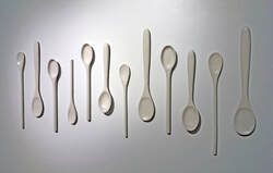
True to 2020 fashion, I "visited" an online exhibition for this quarter's experience post! I visited the Westmoreland Museum of Art located in Pennsylvania, and more specifically Sarah Tancred's exhibit "Heirloom". What originally drew me to her work was the simplicity of it, monochrome and repetitive, which reminded me of my own work. Her work focuses on the socially constructed gender role of women, and how the role has evolved over time and has been informed by several different spheres of life from advertising to everyday objects. Most of her work is sculptural, and the work exhibited at the Westmoreland is primarily cast porcelain and investigates the concept of "invisible labor" that women are responsible for around the house. She focuses on everyday objects that were specifically common around the house in the post WWII era, which I find to be very impactful. Here are a few of my favorite pieces exhibited below:
After a little outside research, I learned that in order to make porcelain pieces you have to create a mold, and while Tancred's exhibit does not explicitly explain this process, you can tell that the repetitiveness in the pieces is definitely attributed to the use of a mold. I really love how simple and monochrome the work is, since the plain-ness of the work really addresses the content of the work and how meaningful and impactful actions (represented by the quantity) can melt into the background of daily life (represented by the white). Honestly, visiting a virtual exhibit was easier and more valuable than I had originally thought. It is definitely missing the impact of scale which you would better experience when visiting in person, but there is also a certain beauty to seeing the pieces captured on camera in exactly the way the artist wanted the pieces to be viewed.
0 Comments
A prop designer (properties designer) is someone who designs props for use in television, film, or theatre. This can include designing original props with specific uses and measurements, or collecting already existing props for the production. Other responsibilities of the prop designer include working with other people on set, including the Set Designer and Costume Designer to ensure that all visuals are cohesive. This role includes more communication and personal skills than I expected, because many times the Prop Designer needs to work with other theaters and productions to borrow props and equipment, so those are relationships that need to be kept up with and maintained since props are a very valuable part of productions and slip ups can be very noticeable on screen. If they are working on a historical piece, they usually also have to do a large amount of research to ensure that all props used are from the logical time period. Most Prop Designers do not formally need to have an official college degree, but most have backgrounds in art and design, model making, or some kind of management. Some of the top schools for someone hoping to become a Prop Designer would be Carnegie Mellon University which has a great drama and costume design program, as well as Chapman University's Dodge College of Film and Media Arts, and New York University's Tisch School of the Arts.
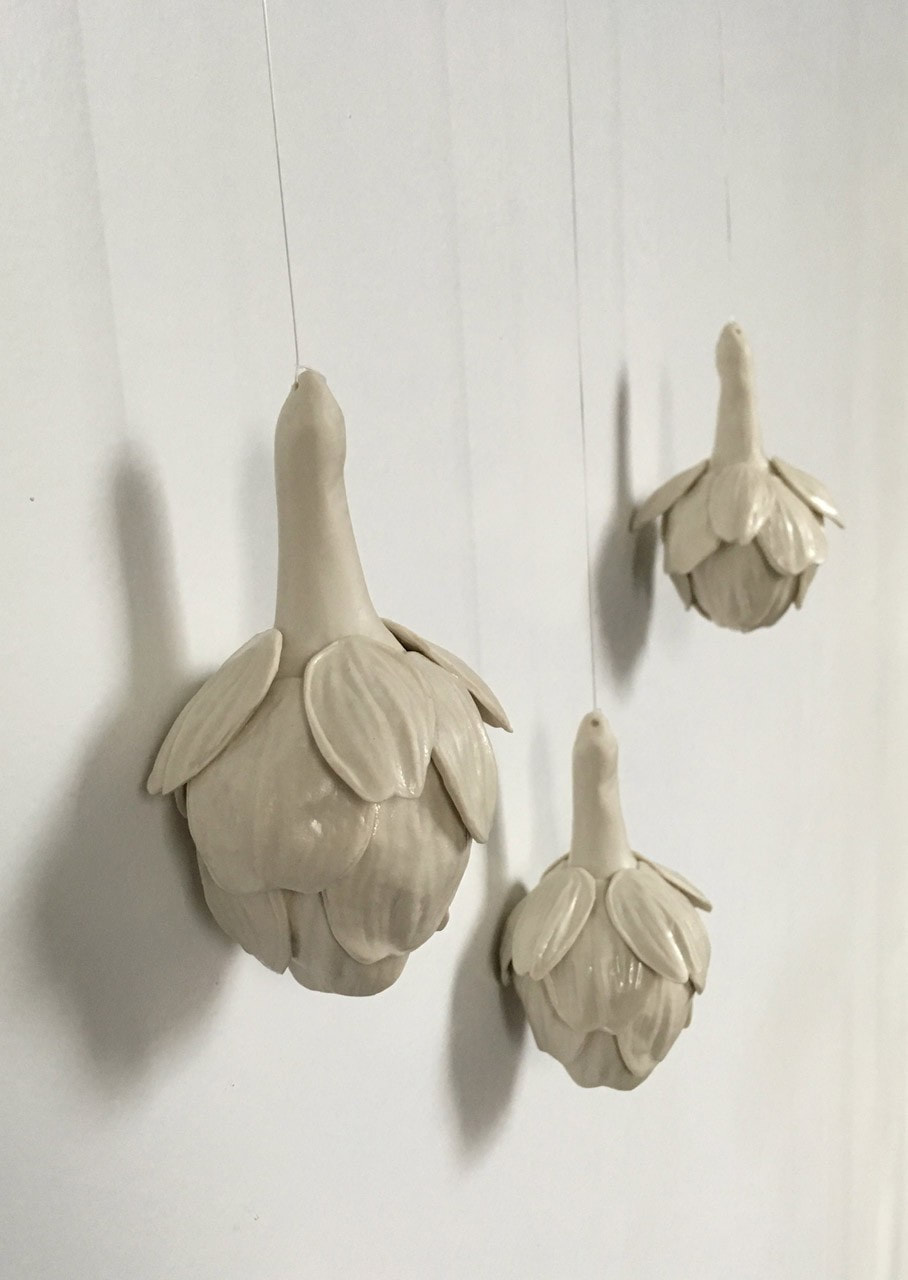
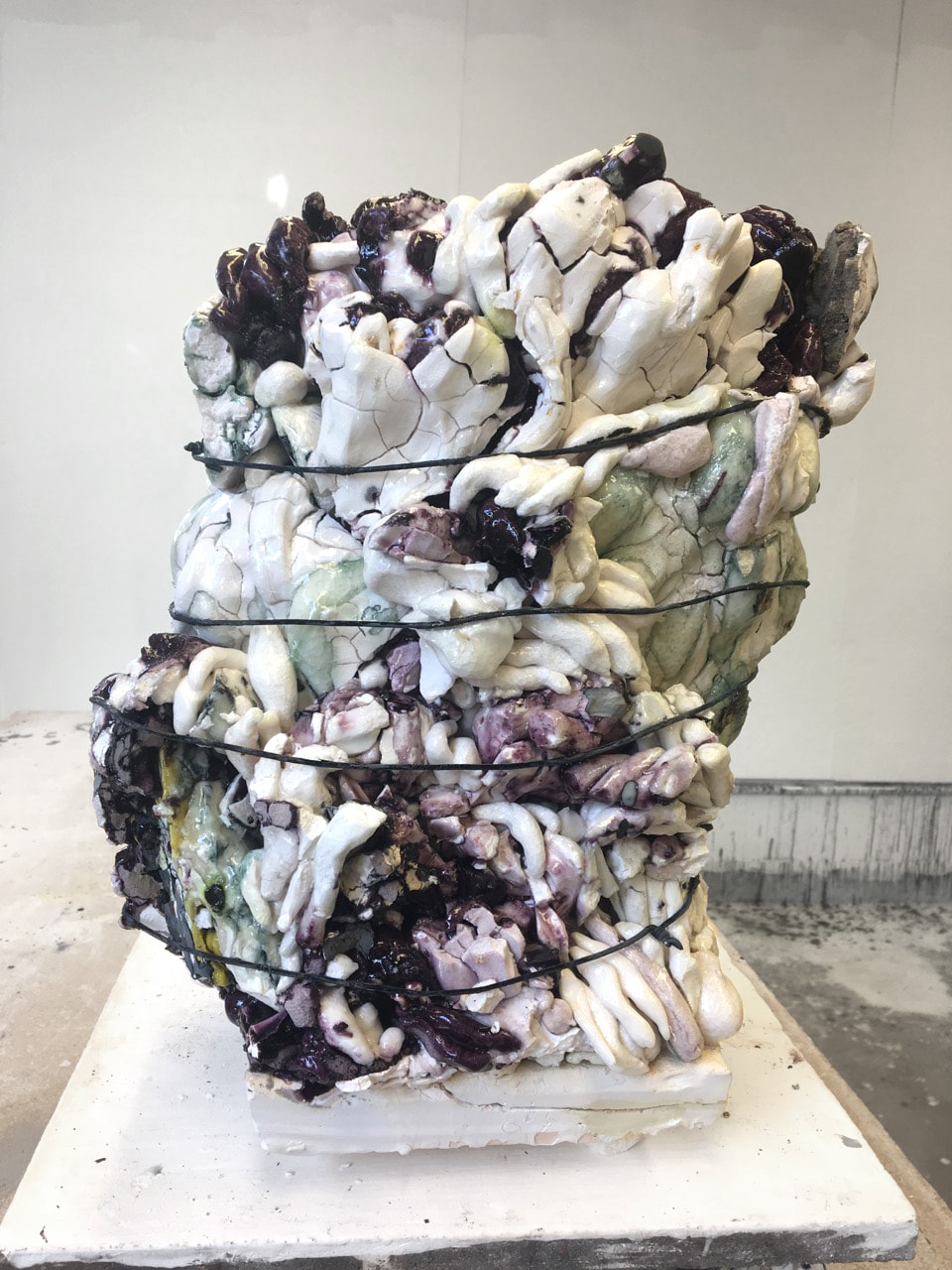
Annabeth Rosen was born in Brooklyn, New York and graduated from NYS State College of Ceramics at Alfred University and then later from Cranbrook Academy of Art. Post graduate school, Rosen spent time teaching at institutions like SAIC, RISD, and Bennington College. She also participated in residencies, and since then has taught at the University of California Davis where she has held the Robertson Arneson Endowed Chair since 1997 and won several grants and awards including the Pew Fellowship and two National Endowment for the Arts Fellowships. Formally trained in ceramics, her work is an interesting blend of solid ceramics and fluid gestures with her work heavily using the elements of color and repetition.
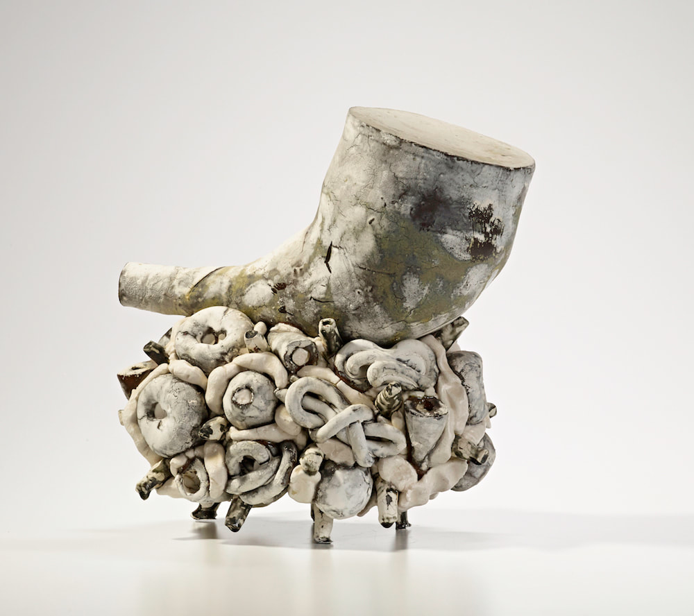
Main things I love about this artist's work:
- how they are large forms made up of several other organic forms - the use of multi-media (ceramics wrapped in wire) - the use of subtle color that emphasizes the smaller organic forms - the scale of the pieces I definitely feel like I can incorporate parts of Rosen's work into my own, mainly the use of smaller forms to create larger forms. There isn't a lot of negative space in her work which is something that I've been trying to incorporate into my own, but I think her forms are interesting enough to not need it. I specifically like her second piece for the interesting use of shape and form, with the horn like shape on top of the platform. Annabeth Rosen Resume: https://anglimgilbertgallery.com/wp-content/uploads/2016/03/Rosen_Annabeth_Bio-1.pdf This lecture was interesting even the second time around, especially since it was a nice refresher of this history of Japanese aesthetics and all the people and cultures that have influenced it over time. The presentation also connected back to the Lunchtime Lecture from a few years about Wabi-Sabi, and I felt like it furthered my understanding of how the Japanese viewed beauty, especially in relation to architecture and how spaces were designed. To them it was imperfect and real, and it’s very similar to what my own definition of beauty has evolved into. I started a bullet journal this summer, and I had originally been very precise with it and tried to make it as aesthetically pleasing as I could. But after a while, journaling in it and decorating spreads began to feel like a chore. So, I decided to not focus on the big picture and try to decorate each part of each page to make one cohesive spread weekly, but rather just use it as the days and week progress, in whatever way it works best for that day. After switching over, stepping back I realized that the pages when all filled up, I still found them beautiful because you could see the work but into each part, even if the spacing was wonky and the headers didn’t line up.
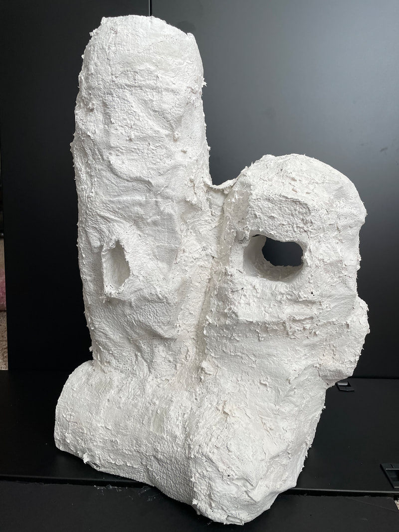
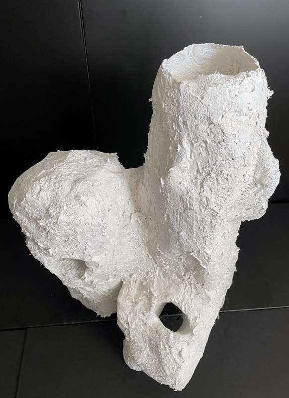
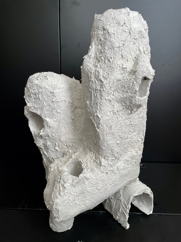
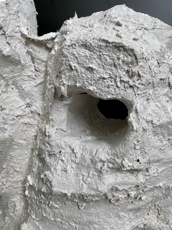
Overall, I really enjoyed the lecture, and I want to know more about how Japanese aesthetics evolved over the years, as we mostly focused on how Japanese aesthetics influenced the east and what Tanizaki, a Japanese novelist, thought about western aesthetics and aesthetics in general. What I’m taking away from this lecture is a new perspective that can be turned into a new style, where I embrace more unmethodical techniques. I decided to go back to my regular type of sculpting and ended up deep diving into the process and not taking a lot of pictures because sculpting is messy, but I am going the skyscraper route. I made a lot of circular shapes by wrapping plaster around balloons which was interesting, but I think the two forms contrast too much. She's done! I really like how the layout came out- I ended up taking the suggestions to do some horizontal and some vertical as well as cutting some pieces in half to make the spacing a little more interesting! I really really liked how this piece turned out. Up close and in person the details are so much clearer. 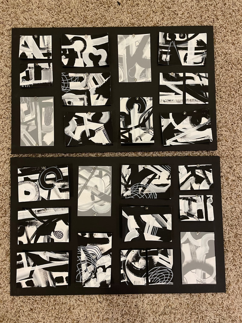 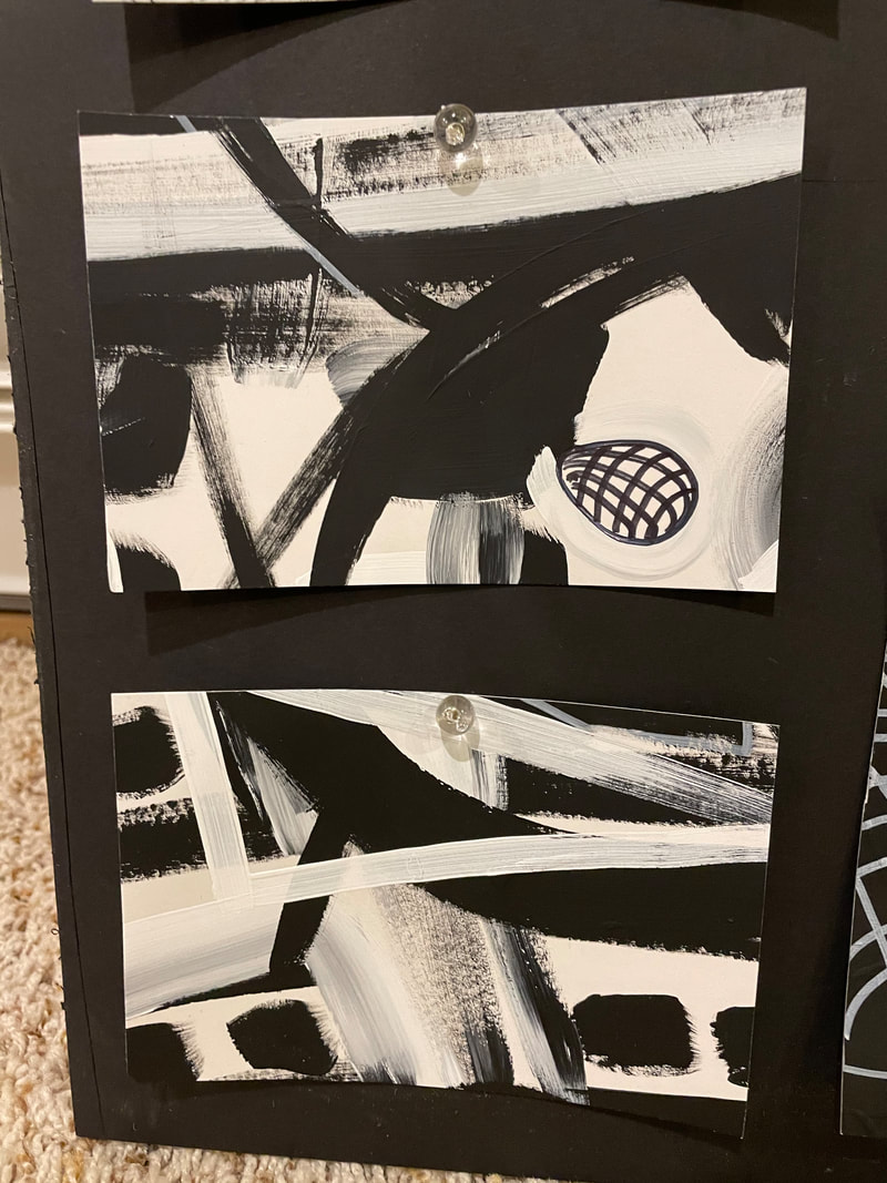 I've been trying to collect "found" items around the house but I'm having a hard time finding items that I think are meaningful. I'm also worried about adding too much weight to the sculpture since it is a relief piece and I don't want it to be too front heavy. I'd honestly prefer the look of taking an entire item and just wrapping it, like a milk jug or like larger items, but that feels too Duchamp to me. I think instead I'm going to go back to my buildings but try other buildings- I'm thinking emulating a skyscraper would be good because it could be a large piece like I originally wanted and I can still use the same technique I did for my other sculptures.
Okay I cut up the pieces (which was oddly so satisfying) and it turns out I didn't even need the whole second painting thing I did so that's nice since I liked the first one so much more. I ended up doing a teeny tiny bit of line work with the pens but then not loving it so I didn't do too much and kinda left it at the few marks. I'm having a surprisingly difficult time figuring out what layout I want to organize this in. I was originally going to just do simple horizontal lines with some pieces covered by the translucent paper but Shreya said it looked way too simple so now I'm just messing around with the layout and being scared to commit. 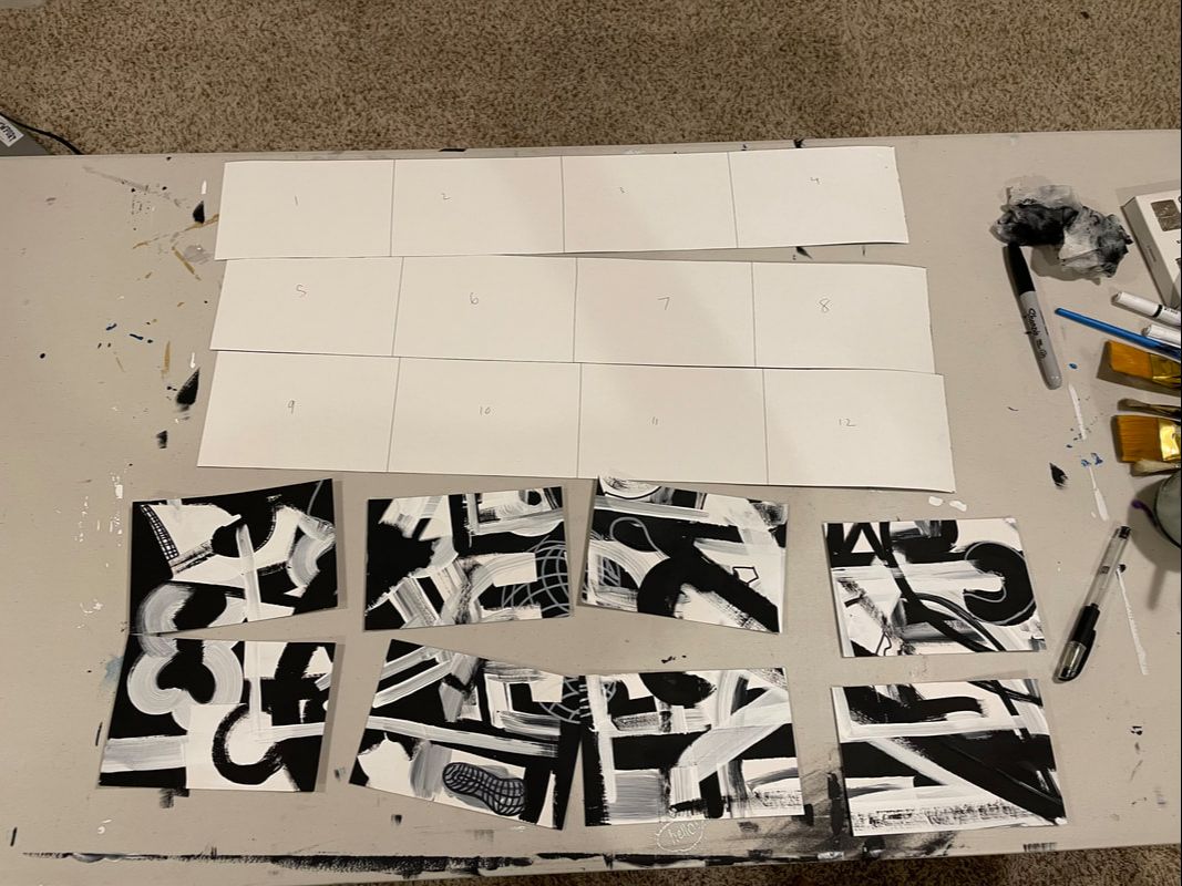 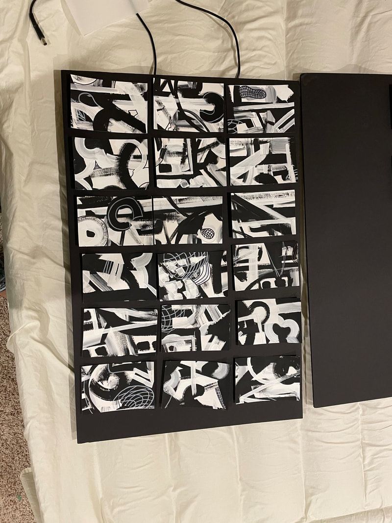 I'm not entirely sure where I want to go with this next project. I was originally thinking of making a large self-standing sculpture thats essentially the same as my first small hut but extra large, but I'm slowly falling out of love with that idea because it feels boring and repetitive. I talked to Coach about it and he suggested doing a relief sculpture with found objects as a way of returning to the idea of familiar but not, and I really like that idea. I kind of feel like that idea would stray really far from what I'm doing with the buildings-vibe right now, but I think its a really good way to further my content.
|
Ria BakshiCheck out what I'm currently working on by clicking the PROCESS button! Archives
December 2020
Categories |
 RSS Feed
